
Writing has always been about learning for me. I’ve started posting regularly on LinkedIn using articles I read as launchpads for my own thoughts.
This way of making connections is a great way to digest the torrent of information I’m bombarded with on a daily basis.
At the end of every week, I’ll compile my daily LinkedIn posts into a newsletter I’m calling Unfiltered design. Below is my first edition 👇.
Design is craft + curiosity
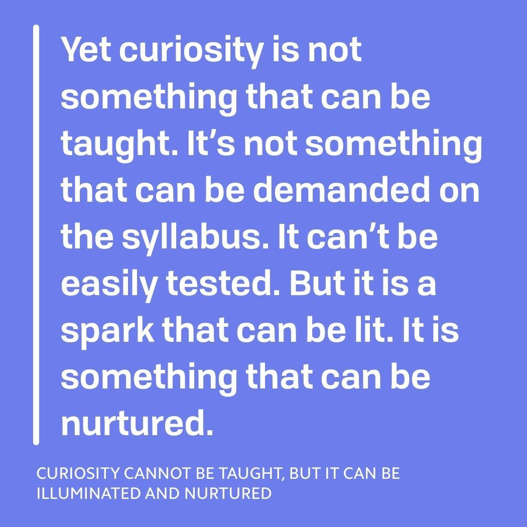
The more I teach design the more I realize that it is a combination of two components: craft + curiosity.
Craft is easier to teach. As a technical skill you can demonstrate the tools and have students repeat processes in order to get better and faster.
Curiosity is what I’ve always been interested in because it is elusive. In design it’s crucial because without it, a designer would be unable to ask the questions needed to tackle complex problems.
Many design schools output fine craftsmen though the curiosity seems weak. These are hireable because portfolios are fleshed out and companies ultimately need someone to execute a leader’s vision.
If a school were to appear that excels at inspiring curiosity without sufficient training in craft, it would have a problem incentivizing students to come as job prospects after graduation would be low.
Though I don’t believe the two are at odds, craft is more compelling to teach because improvement is easy to observe. Students are more excited by it and instructors can demonstrate growth very easily. Curiosity is practically impossible to measure, improvement is slow, and incentives to improve are low since it’s a skill that’s impossible to demonstrate concretely.
Still, this is a challenge I am very keen on tackling some day. How can curiosity be sparked in a repeatable way? How can the apathetic be moved into inquisitiveness?
Apple’s hatred of web-based tools is plain annoying
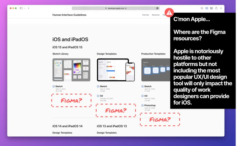
I can only assume that Apple hasn’t included Figma files because there is no native Mac app. It’s very unfortunate.
Apple is notoriously hostile to other platforms but not including the most popular UX/UI design tool will only impact the quality of work designers can provide for iOS.
Standardization is great for understanding and not so good for magic
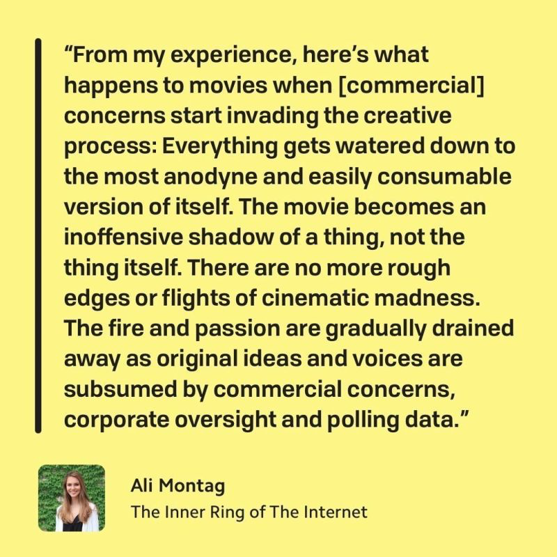
This quote makes me think of standardization in software interfaces. Though not so direct a comparison, as I don’t believe that standardization necessarily means watering down, but it does mean significantly less wonder in our tools. The upside of familiarity of course is increased speed and less retraining.
That said, I do miss the early days when any two apps barely looked the same as each was trying novel interaction experiments. From it we got a wonderful experiments like the iPhone app Clear and later on iPad, Paper. Android used to get such a drastic overhaul every year that owning an Android phone for 3 years felt like 3 different phones.
These days we nuggets every now and then of apps that break the mould. TikTok, for all the flack it gets, is actually relatively groundbreaking in what it has done both for the consumption and creation of mobile media. Another app that comes to mind, which is much less popular and unfortunately being sunset, is Honk: https://honk.me/
That app was flipping messaging on its head with some crazy full screen interactions and character by character chat.
Part of the reason for this standardization is user expectation, but another less discussed part of it is the standardization of the design process as well. I’ve been thinking deeply, though with little success, about how this mould can be broken in order to embed deeper experimentation throughout the process.
On the other hand, with UX/UI is standardization even bad? Unlike art, the point isn’t wonder in most cases… it’s usability 😅.
“Design isn’t a process; neither is chess.”
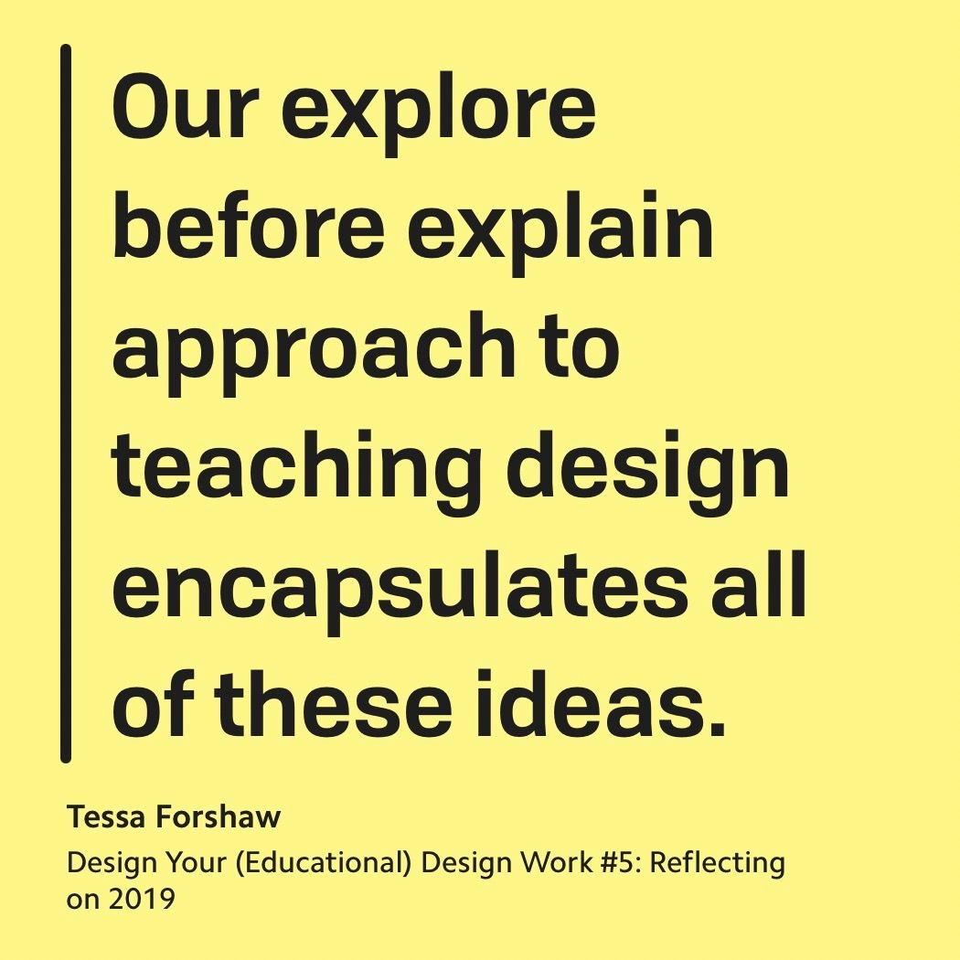
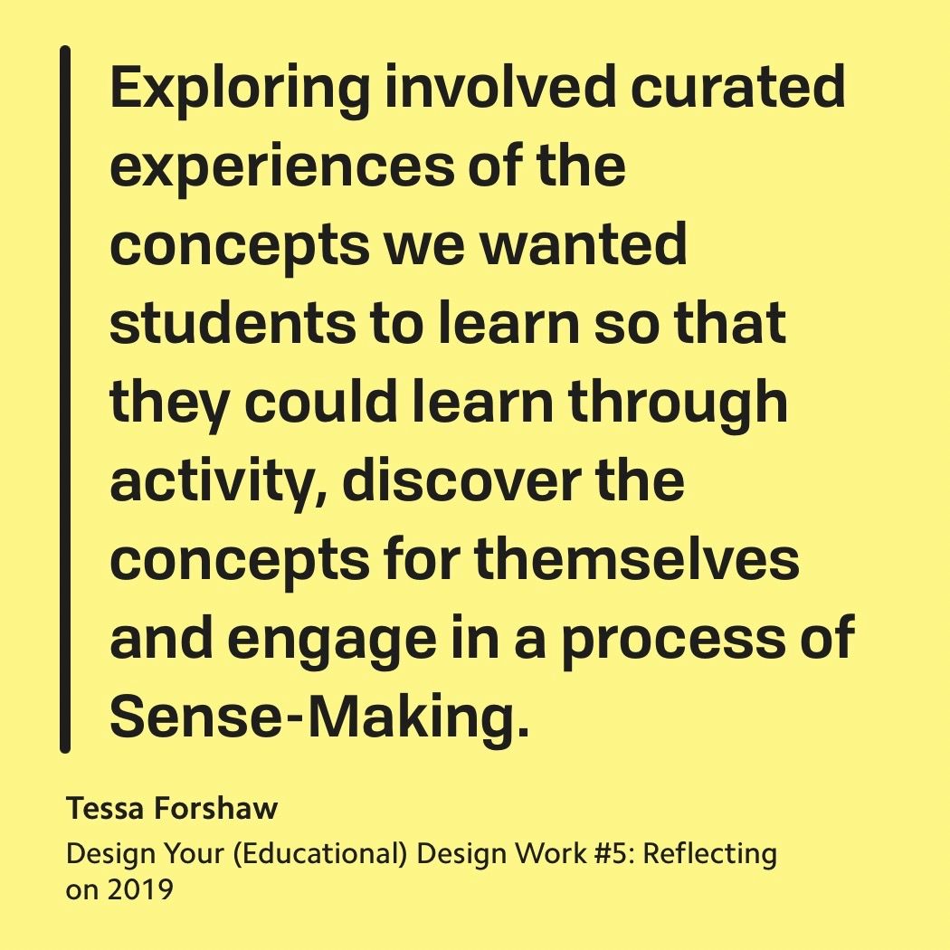
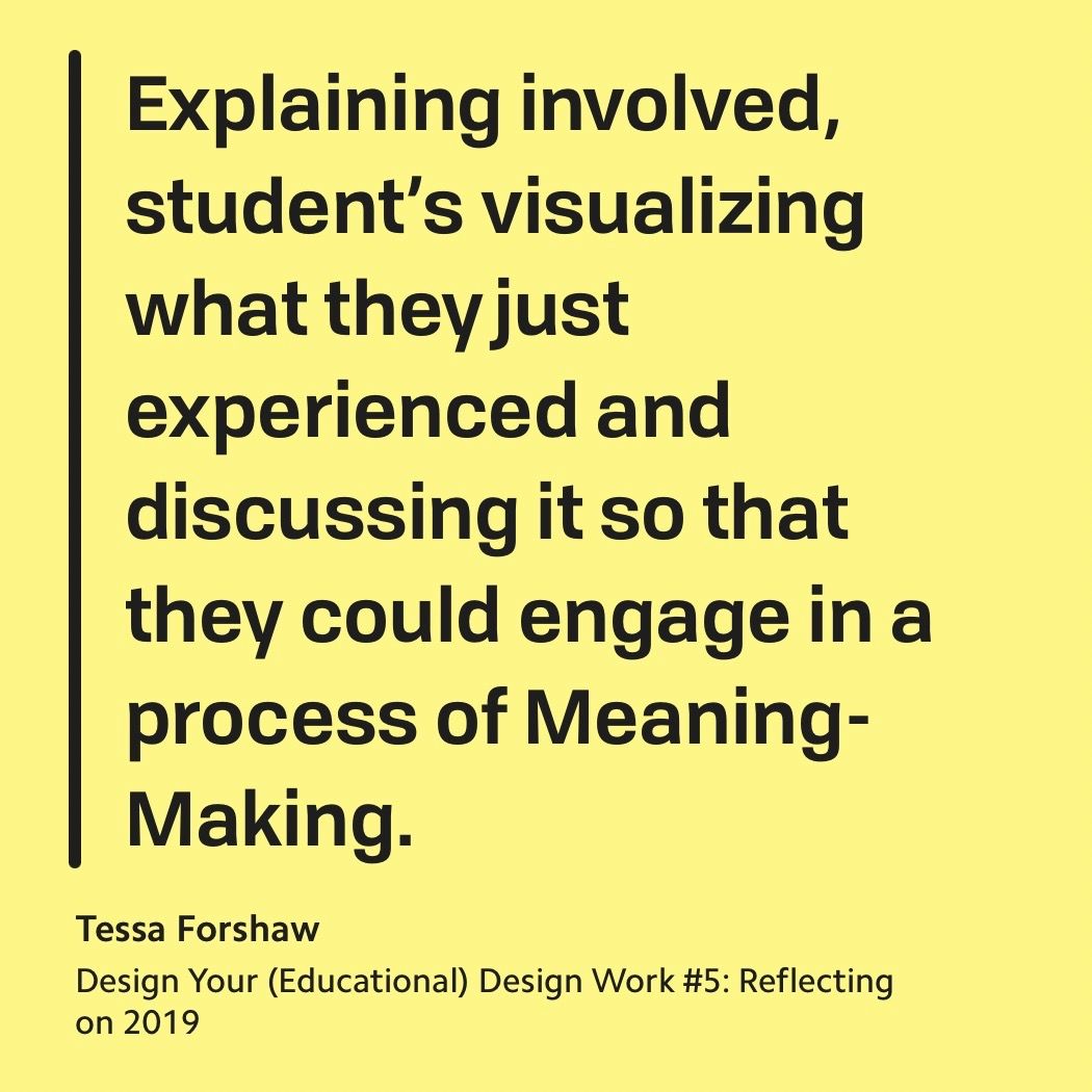
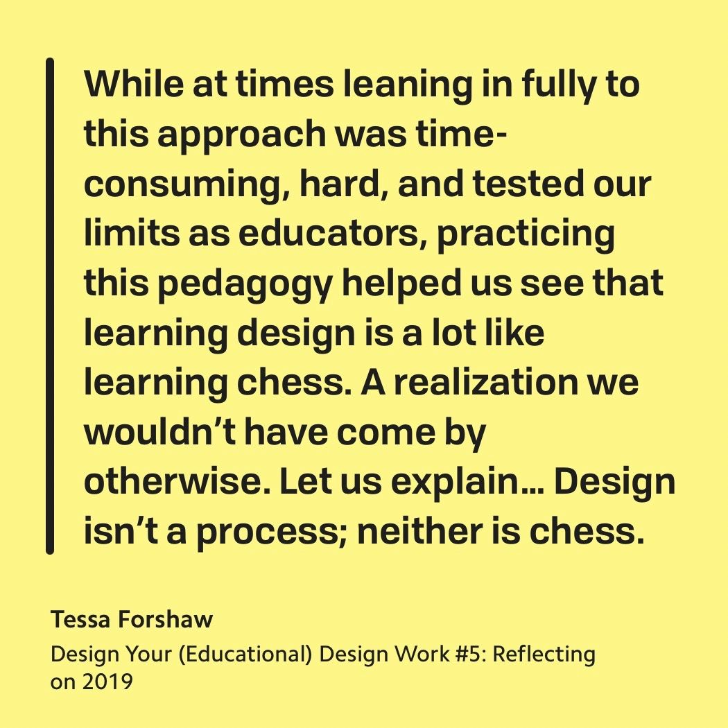
This is from the d.School‘s 2019 Spring cohort where one of the instructors, Tessa Forshaw, explains the lack of linearity in the design process. Why this is fascinating to me is less because it’s about design and more because it’s about learning in general.
The idea that you can give students a toolkit and then ask them to try out the different combinations and permutations, then reflect on what works best is a fantastic idea.
For design is makes for better practitioners. Broadly speaking it creates better thinkers. What other fields can we apply an approach like this ?
To notify or not to notify…
I’m a little torn on the whole “don’t send email after a certain time” situation. On the one hand I understand the argument that it’s about protecting your recipient’s mental health. On the other I feel like we should be in a situation where people feel comfortable not responding and turning off notifications.
From a design perspective, the question boils down to who we feel is responsible when it comes to digital etiquette. Should the sender consider the time or should the receiver manage notifications?
Thank you for enduring these unfiltered thoughts. I like to think of them as beef jerky… tough to chew but delicious and maybe a tad too salty. But maybe I’m just lying to myself and they’re more like salted rubber.
If you enjoy this and want the daily updates, you can follow me on LinkedIn.
All the best,
Charlie