Ground News
Ground News lets news readers compare how a story is covered by thousands of sources across the political spectrum. It has helped over 250,000 reader escape their echo chambers and see the news from a different perspective. Ground News was created to be a news destination for everyone, regardless of political ideology.
Overview
Problem: Ground News relaunch their launch website as a full product that provide the same value that users could get from the app.
Users & audience: Casual readers, journalists, politics enthusiasts.
Role: Product Designer, User Research, Visual design, Prototyping & Testing.
Scope & constraints: The new web product was to be built from the ground up and get released gradually.
What I did
The primary value of Ground News is enabling users to easily understand the political leanings of different publications reporting on a story. Their mobile application was doing a job of this and had a steadily growing number of subscribers.
There were a variety of projects I worked on at Ground News including:
- Full relaunch of the web platform, redesigning and iterating on every page
- Introducing a subscriptin checkout flow
- Creating a browser extension
- Developing a design system for the social media marketing team
- Designing landing pages
- Email templates for our periodic newsletters
Reading on the web
The web platform was initially designed as a way to funnel users into the app. Now the task was to make web as effective as mobile app as well as introduce a way for users to subscribe on there directly.
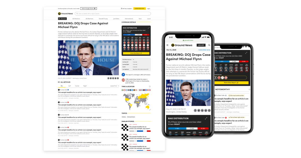
Article view
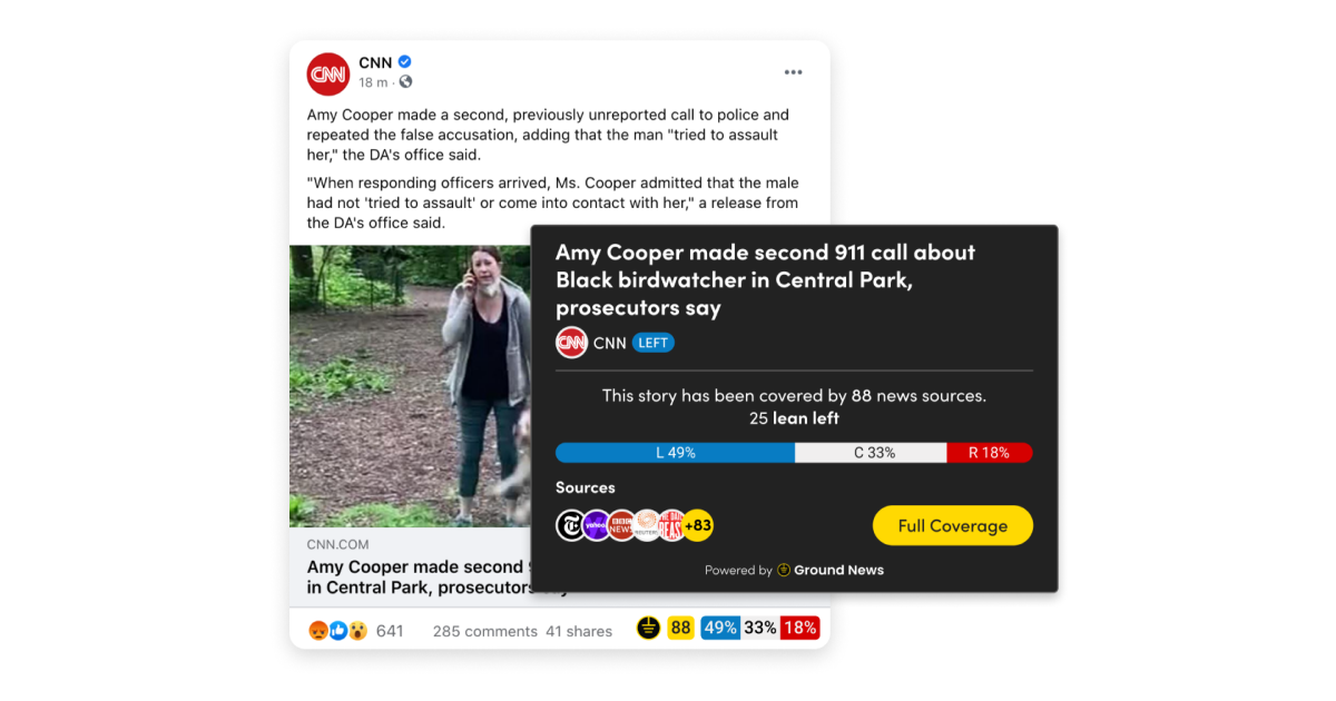
The first project was the article view because it was the place where we could test what features users wanted in the web platform. The original designs didn't include the iconic "Coverage Analysis" from mobile and so this was one of the most essential things to draw attention to on the web.
This meant that the article view didn't sufficiently provide the primary value of Ground News: a holistic view of the political leanings in the reporting.
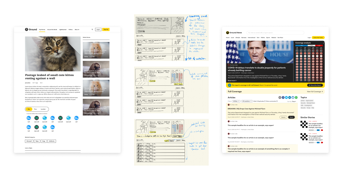
After releasing the updated version of the site and monitoring user feedback, we learned that the coverage analysis was effective, but a lot of the other features were still not easily accessible on web. Within a couple of months from the release of the new article view, we iterated on a version that was more mobile friendly and conveiently displayed all the most important information.
The following designs are the ones that performed the best with our users.
Homepage
The original home page featured one top section followed by a simple infinitely scrolling list of all the latest stories.
From the behaviours and metrics we saw in the new article page as well as what qualitative interviews revealed what users were looking for, we decided to focuss on explainability and exposure when designing the new page.
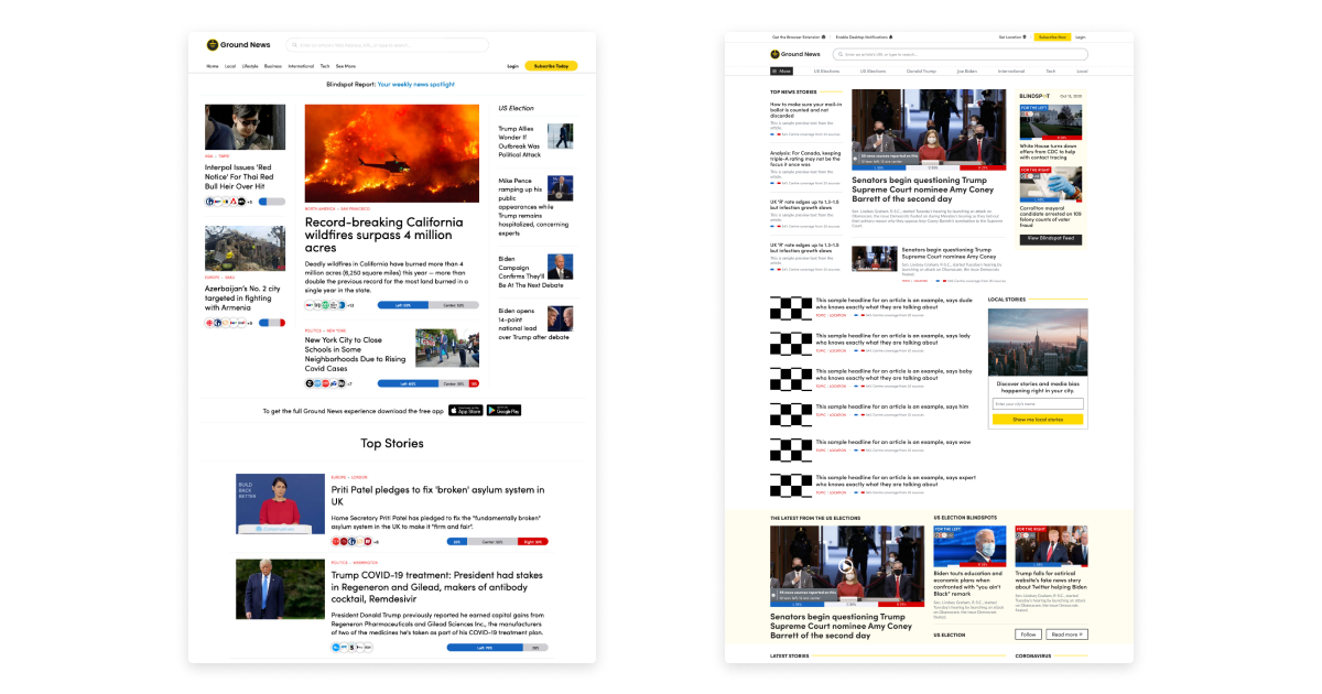
We introduced a variety of new visualizations and sections to help users make sense of what was happening in the news that day. These changes include:
- A new mini visualization of the coverage analysis under each article
- Sections to highlight trending topics
- Blindspot feature in the top section based on the well-received Blindspot newsletter that we introduced
This new design significantly increased discovery of our various different features and paved the way towards 4x growth of our monthly active users.
Subscription flow
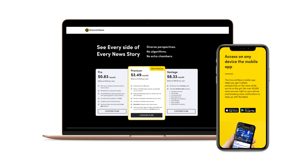
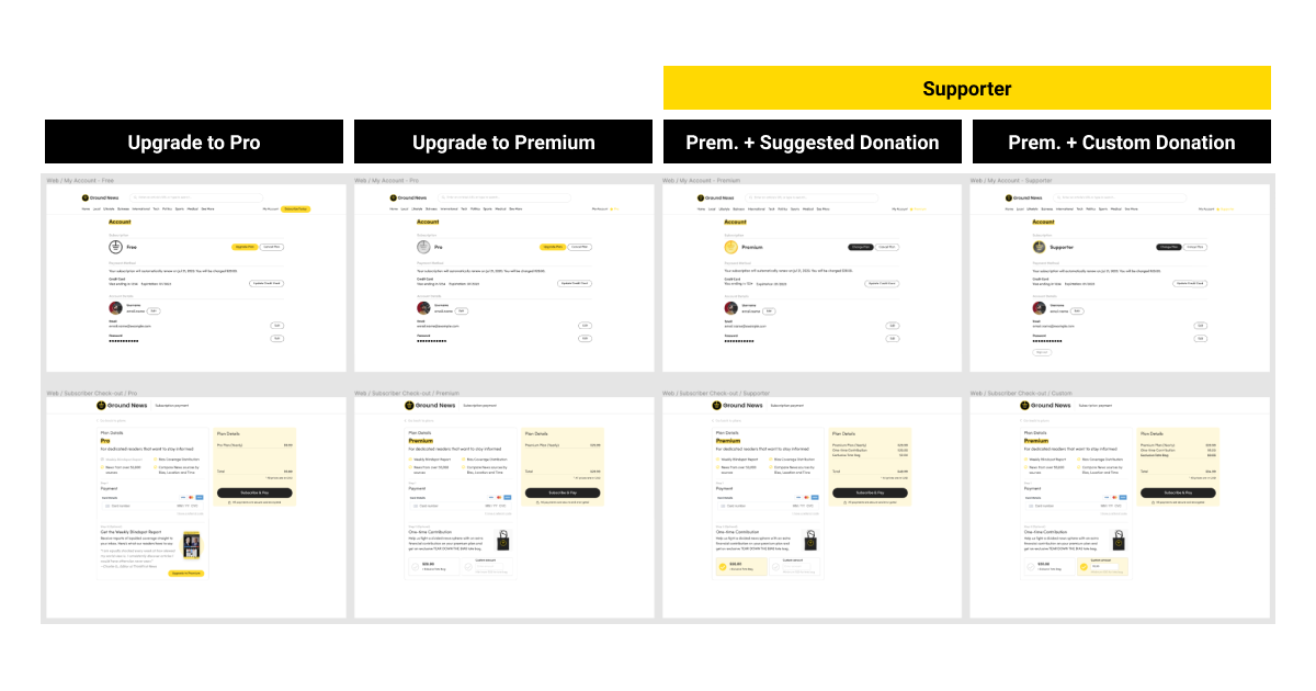
Ground News was exploring its pricing strategy and we had to develop a subscription page that was easy to modify and run A/B experiments on. What we needed in the checkout flow were three different end states:
- Pro: Basic features
- Premium: Upgraded features
- Supporter: Upgraded features + tote bag
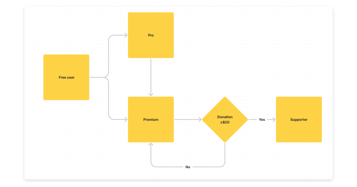
The different states meant that we had four different activies a user could do while checking out. We tested several designs, hiding different components and consolidating steps, but in the end the design below had the best conversion rate.
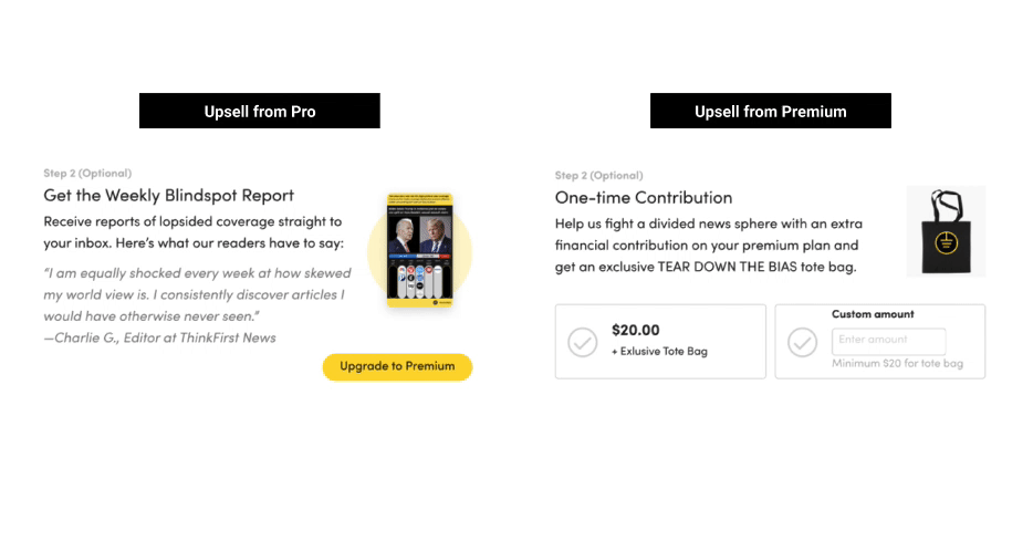
During checkout, we had an optional second step to offer users a chance to upgrade before completing their subscription. After running a few A/B tests, the designs below won out.
If a user had originally selected Pro, the prompt came with a testimonial and an explanation of the added offering. Whereas going from Premium to Supporter just added a tote bag, so we displayed the bag and provided two options for upgrading.
The launch of the subscription flow contributed to a 4x increase in our paying subscriber base within 3 months of its launch.
Browser extension
For a group of our power users, we wanted to provide the ability to use Ground News from anywhere on the web. Since over 48% of all Americans get their news from social media, we created a browser plugin that embedded the Ground News data directly into social media feeds.
Originally we created a rough beta and sent it out to our most active users. After we received feedback, we added some tweaks and decided to launch it on Product Hunt for a wider launch.
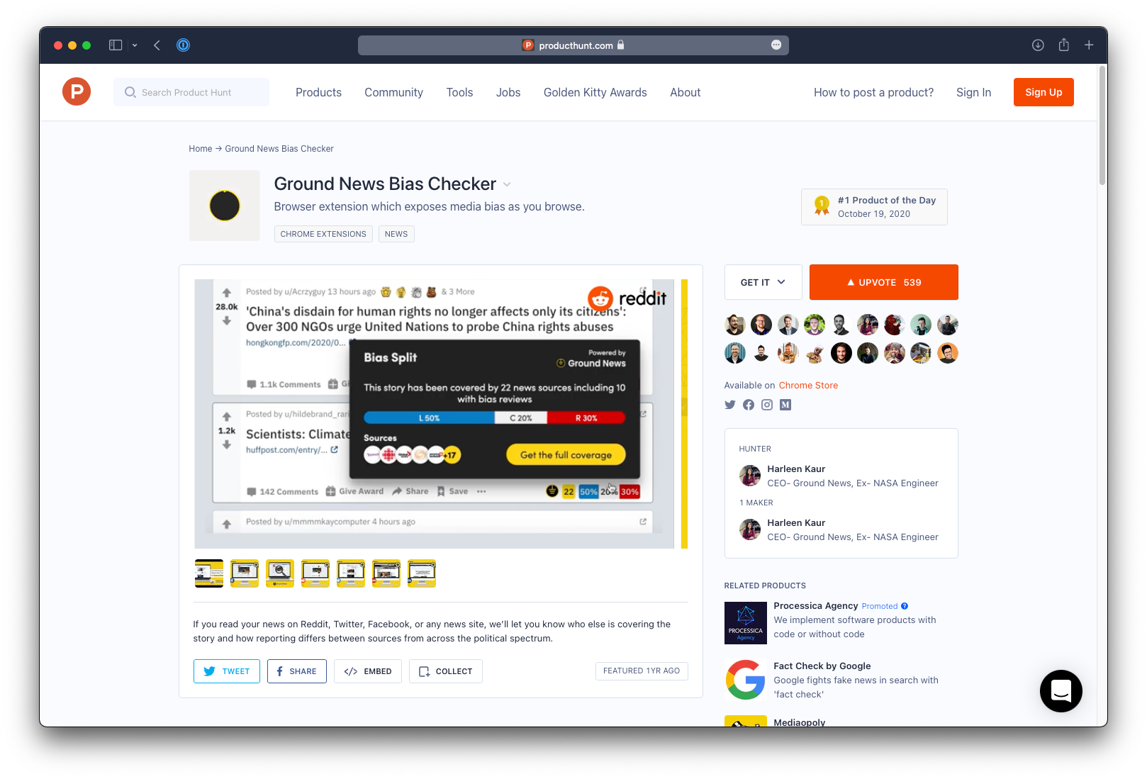
It quickly became the #1 Product of the Day resulting in several thousand downloads and helping keep users engaged with Ground News both on and off our web platform.
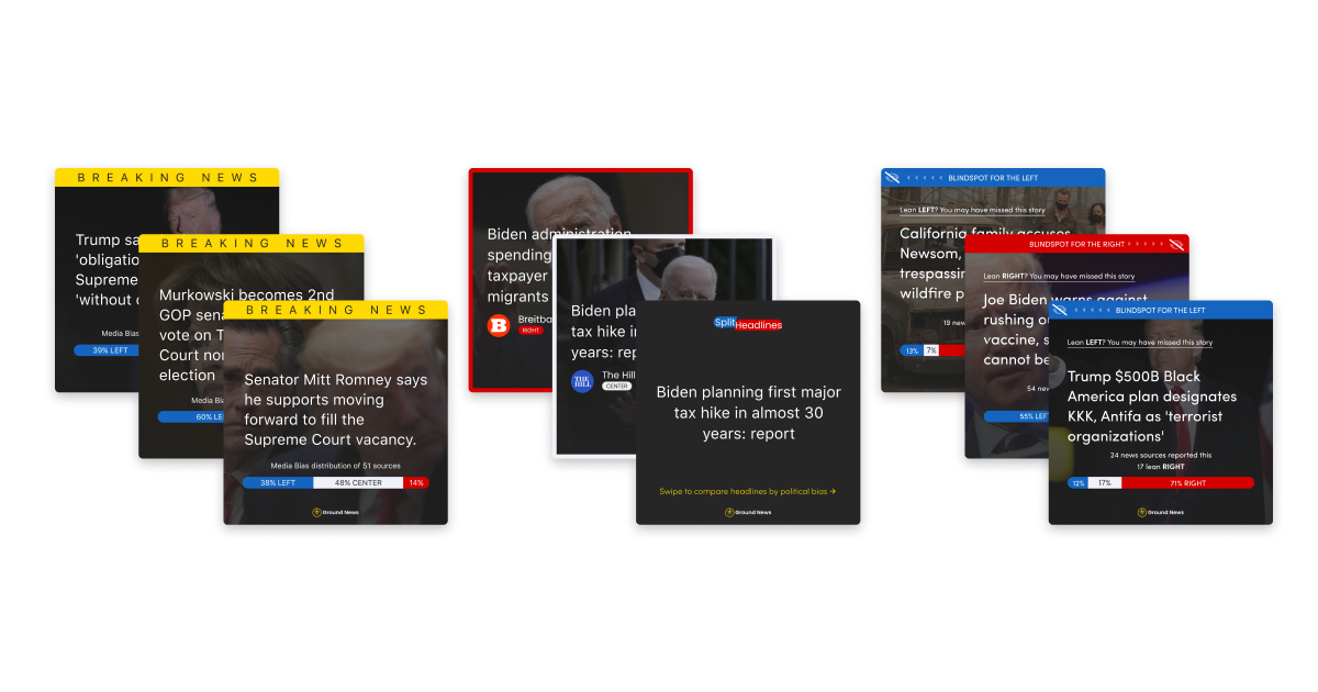
Social media design system
With the amount of data that we gather at Ground News, there was an opportunity to create several interesting posts a day about the bias in the news. However we had a very small team on our marketing side, none of which were designers.
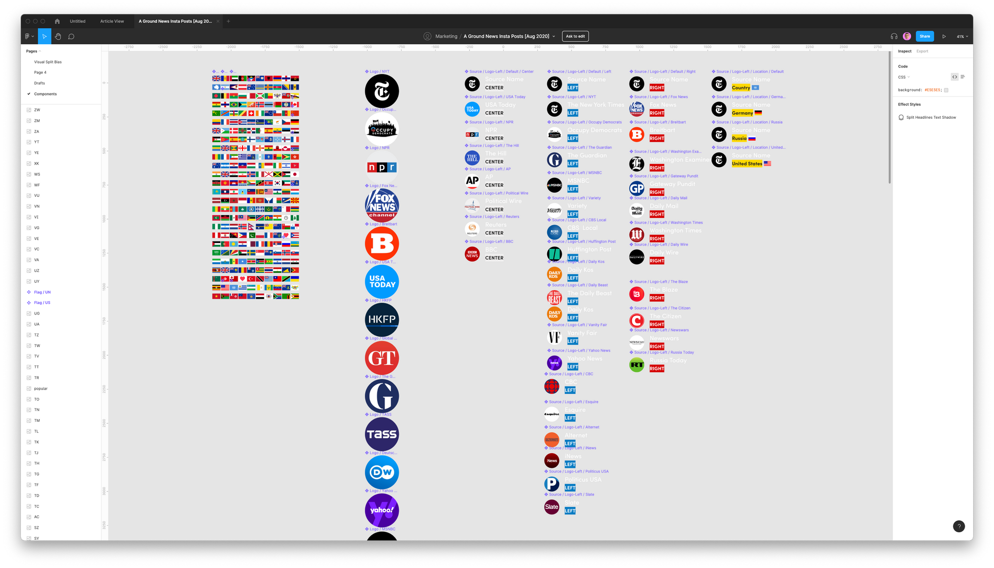
The component library and autolayout templates enabled the marketing team to increase the posting from a couple of posts per week to at least three per day. The new posts with high quality images and clearly depicted political leanings got incredible engagement, and so quickly many different themes of templates emerged.
Together with some targetted ad campaigns, this took the Ground News Instagram page from 2.5k followers to over 12k in a couple of weeks. Today the system has been automated with code using largely the same designs and the Ground News page has over 60k followers.
Results
Over the nine month period in which Ground News was my client, we had introduced over 20 different new layouts for the web platform, a design system for the social media posts, and several different landing pages and newsletters.
This led to:
- 6x growth in our monthly active users
- 4x growth in our subscriber base
- 10x growth in our social media following
Learnings
Juggling so many different projects during a part-time contract was exciting but it came with its prioritization challenges. We had talented developers who were willing to release features directly to the production server and iterate on them quickly and frequently. In some cases however, more research could have resulted in fewer back and forths between design and development.