Nimbus Learning
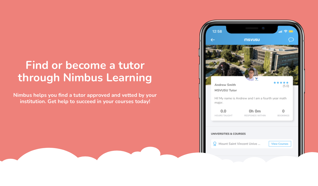
Nimbus Learning provides a seamless workflow that connects students to tutors and other aspects of higher education – such as mentoring programs and advisors. Program administrators, educators and staff are able to access analytics on their programs, allowing them to see what support services are most used and which are most in demand.
Overview
Problem: Nimbus needed to updgrade their experience to help students discover new features without distracting from the core tutoring product.
Users & audience: Students who need to cram, students are proactively seeking higher grades, young adults looking to develop their hobbies
Role: Product Designer, User Research, Visual design, Prototyping & Testing.
Scope & constraints: A team of 2 developers and a two-sided market place that has competing demands.
Process
Nimbus had just scored some big deals with some of Canada's largest universities and it was time for them to upgrade their product with new features including:
- Tutoring for skills outside of the classroom like music, art,
- Whitelabelling for universities
- Improved chat so students can coordinate more clearly with tutors
They hadn't done a thorough scan of the competitive landscape and their qualitative interviews with students were outdated.
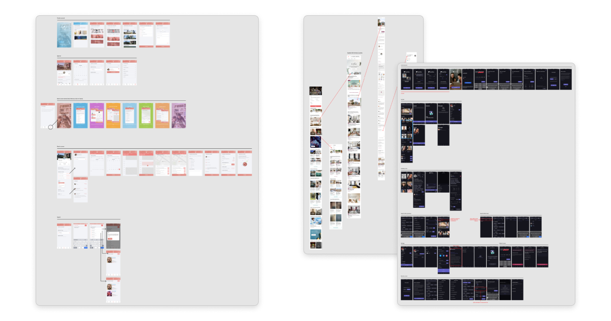
Starting with a full analysis of their app as well as those of their competitors gave us a sense for where the industry was headed. It also provided us with some new hypotheses that needed validating with the Nimbus userbase.
We conducted several rounds of interviews with some of the most active students on the platform and came up with three personas that needed some new functionality the most:
- Students who need to cram (existing)
- Students are proactively seeking higher grades (existing)
- Young adults looking to improve their hobbies (new)
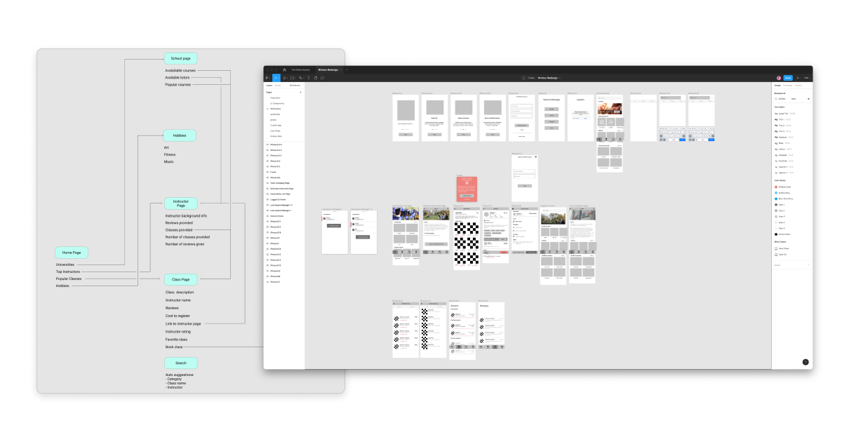
Based on the above user journey mapping and lofi prototypes, we were able to put interactive demos in front of those different personas and learn more about their expectations.
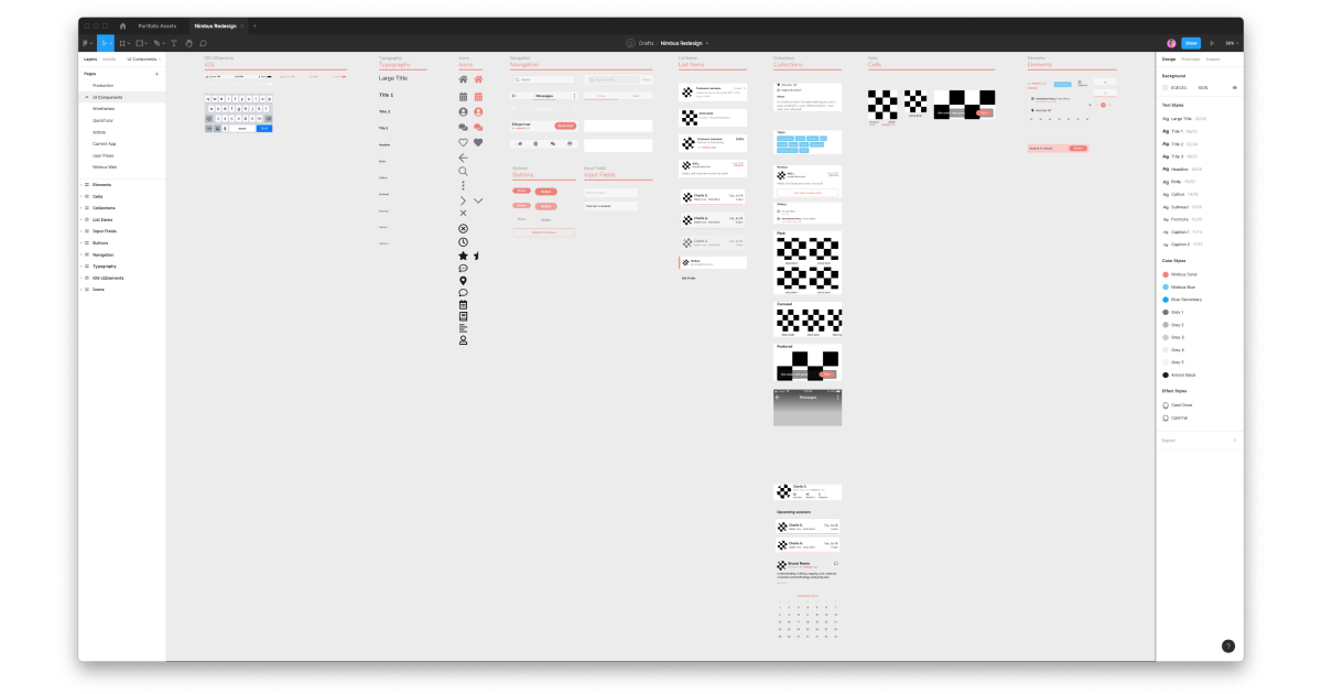
This is what we needed to build out a new set of components that would work on both iOS and Android. They were also flexible and multi-purpose to reduce dev time since Nimbus has a very junior and small team.
The resulting app was a dramatic improvement on the existing one, with positive reviews from the users we tested with and achieved our desired metrics.
Results
- Improved discovery of courses
- Reduced bounce rate during booking process
- Integrated new chat functionality