Understand COVID media engagement with a simple mental model
How a graph can reveal unexpected patterns in a chaotic situation
Throughout the pandemic, the most reliable source of information has been the scientists and medical community, and yet we continue to get two levels of filtration between the best source and ourselves. The first filter is the government and the second is the media. The government distorts it one way, the media distorts it another, and in the worst-case scenario, the media distorts what the government has distorted about the science.
As a reaction to this societal failure, people are being told: if you want to be intelligent, you have to put in the work yourself and do your own research.
Though I started the pandemic keeping a close eye on the media and proactively shed light on the flaws through social media, this came at my own cost. My sanity started to dip and my anxiety started to spike. Since December 2020, I don’t consume a single line of news outside of what friends and family send me through messages. Stepping back and receiving news filtered exclusively through personal connections, I have had the time to reflect on the patterns of news consumption during COVID.
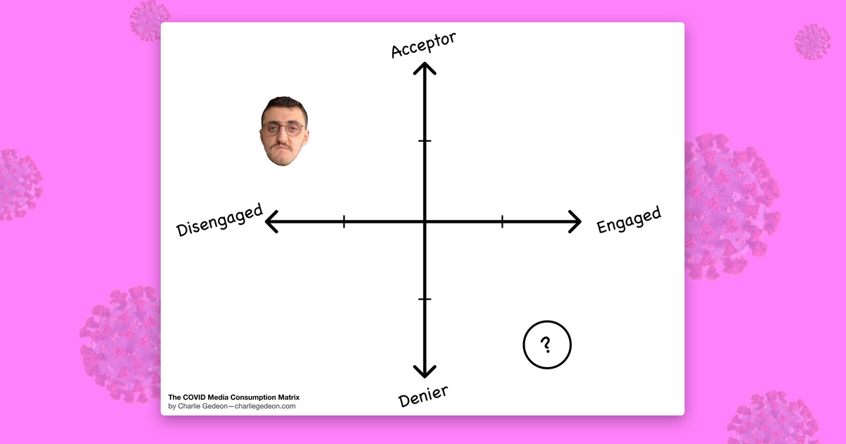
Below is a graph I have landed on after playing with a few different classifications. I call it the COVID Media Consumption Matrix.
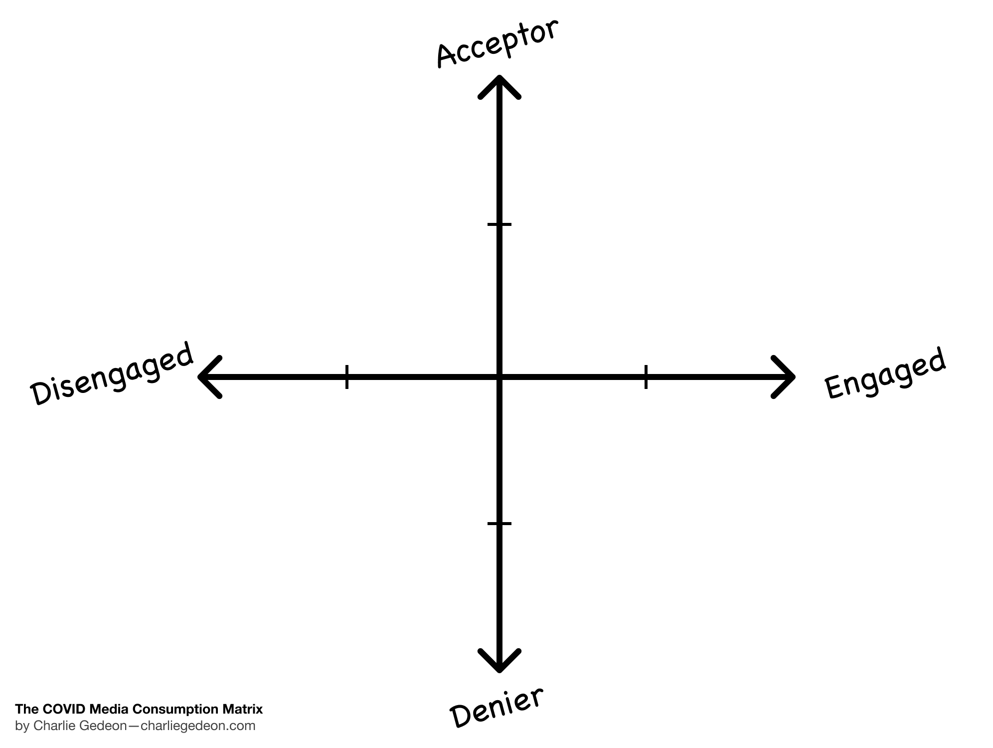
Explaining the COVID Media Consumption Matrix
I’d like to start by acknowledging that this is a proposed mental model and is not meant to be a statistically valid tool for classifying the population. Instead, think of it as a more involved metaphor to aid you with sense-making in these hectic and chaotic times. Let’s begin.
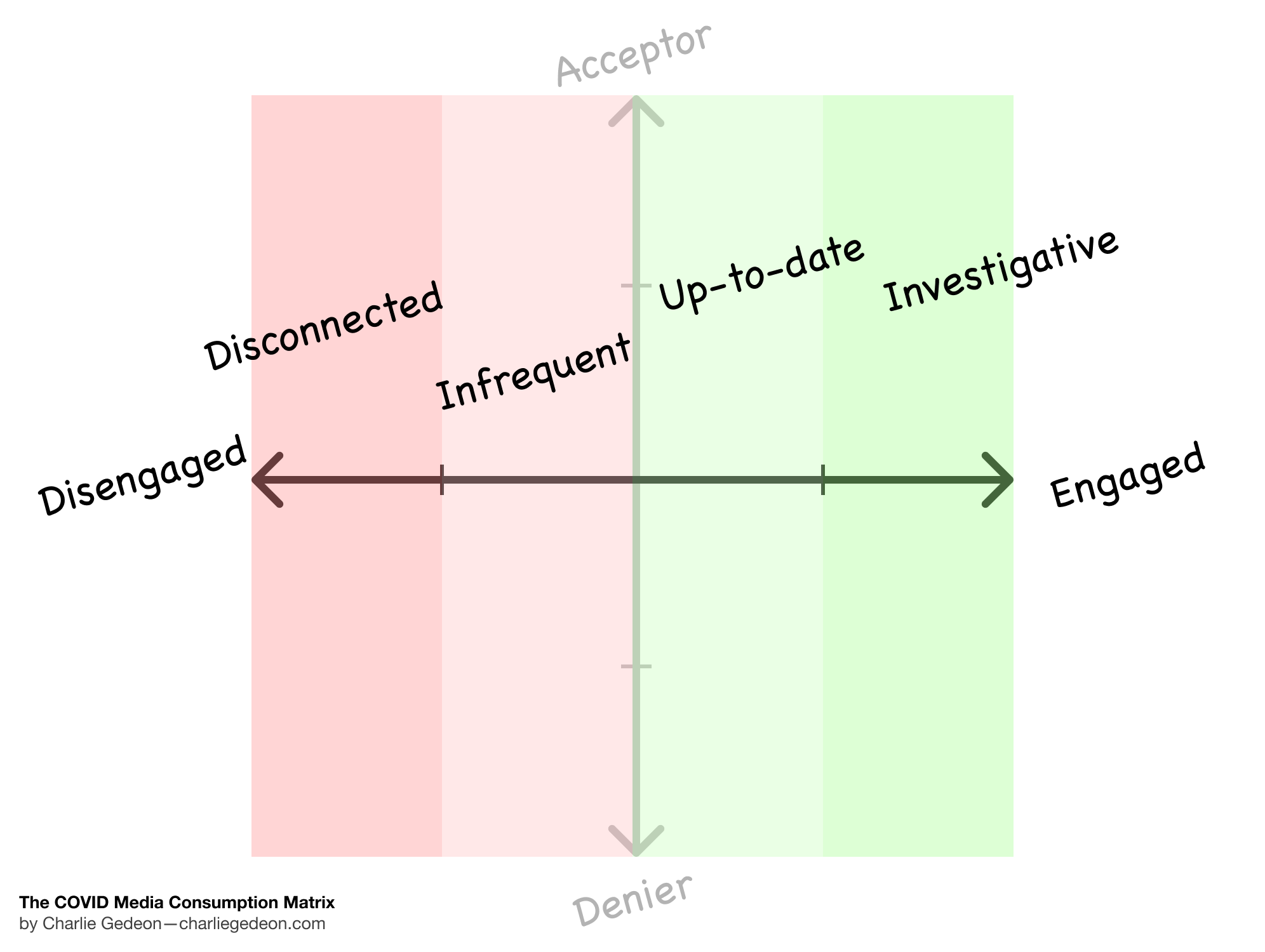
The x-axis is Engagement. It helps us classify how much someone engages with information related to COVID. I’ve broken it up into 4 different sections.
- Investigative: People who are going beyond the standard media to do their own research and educate themselves.
- Up-to-date: People who keep up with all the news.
- Infrequent: People who are maybe lightly informed occasionally but wouldn’t know the latest information.
- Disconnected: People who do not read the news at all and are likely only informed through alerts as well as friends and family.
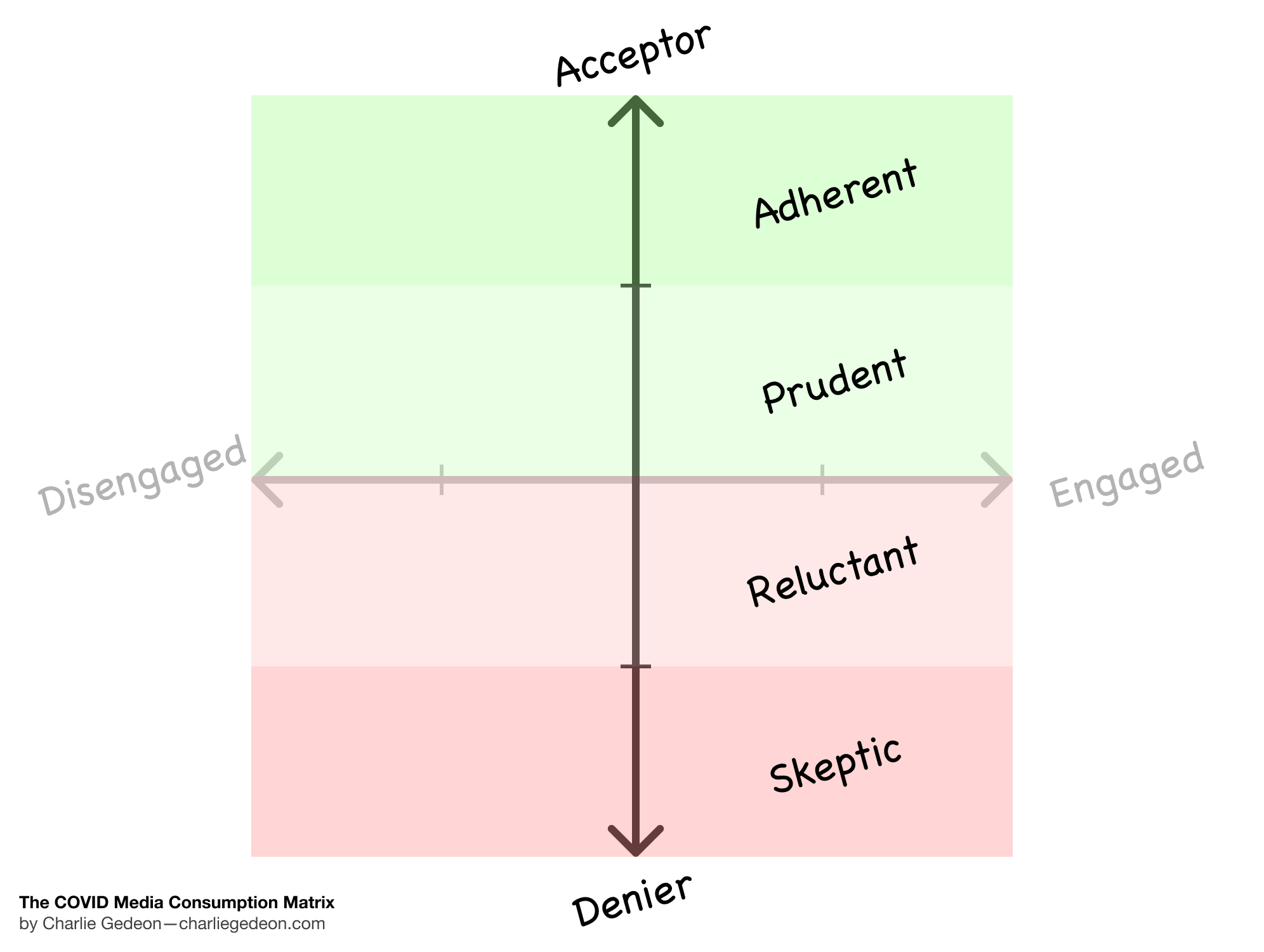
The y-axis is Scientific Acceptance. It helps us plot people’s acceptance and denial of COVID-related science and facts. Here too, there are 4 different sections:
- Adherent: People who take up the scientific news quickly and accept the government's restrictions without too much of a fuss.
- Prudent: People who accept the science after it has settled with sufficient evidence and have questions about the government restrictions, but are willing to follow.
- Reluctant: People who question all the science, with or without evidence, and are generally frustrated with the restrictions but don’t actively protest them.
- Skeptic: People who refuse science without evidence and are actively protesting all restrictions.
16 media consumption personas
Naturally, these hard gradations can be completely blurred to make a smooth gradient with an infinite number of potential labels, but this isn’t useful for sense-making. Instead, we can cross the 4 levels on both the x and y and we get 16 different personas. E.g. Adherent Investigative, Prudent Disconnected, etc.
Without going explicitly into each of the 16 persona’s behaviours I want to address few things here for clarity.
The first is the kinds of sources an Investigative Skeptic vs. an Investigative Adherent would read. Think of the skeptic as an extreme denier of COVID. This person might believe that COVID is a coordinated effort across governments to suppress the people. An investigative version of that would be someone who is scouring the web for information to confirm their worldview and maybe even actively sharing on forums to spread their ideas. On the other end of the spectrum, adherents who are investigative are proactively going to science publications and maybe even diving into some academic journals. However, unlike the Investigative Prudent persona, adherents are more prone to confirm their worldview.
With some extremes explained, I will leave the others up to you to fill the blanks. As I stated before, this is not an academic model and as such, giving you some leeway to interpret is actually beneficial.
Additional explanation
It’s much easier for the human mind to understand 16 classes rather than 50 or 100, let alone the infinite reality. I also did my best to stay away from words that are too negative or inflammatory. Some of you may be wondering where a conspiracy theorist might go. I wrangled with that myself and landed on simply placing them on the far bottom of the denier spectrum, but ultimately they are still skeptics as per the word’s definition.
Applying the matrix
There are a variety of ways to apply a classification tool like this. You could plot the people in your life or famous figures against it and see where they sit.
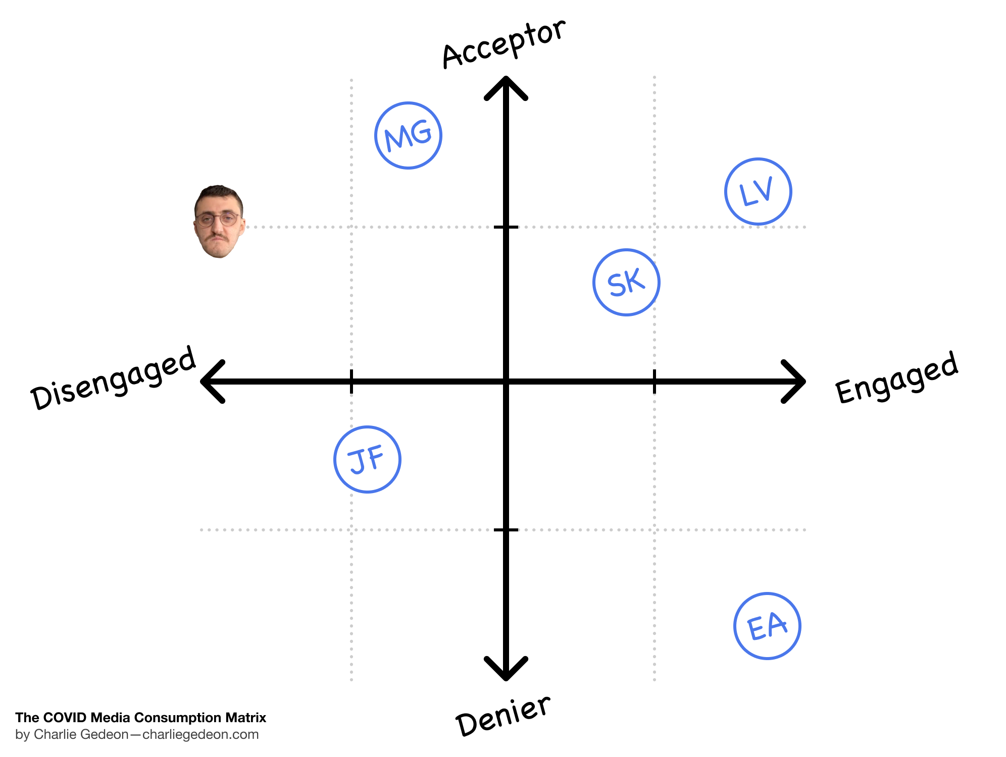
In doing this exercise we can get a sense of where people sit relative to others. You may think of yourself as a prudent infrequent consumer of COVID news until you plot your best friend and you realize that actually you need to adjust your position.
More interesting than plotting others to me was plotting myself over time. When the pandemic first started, my approach was completely different and it’s interesting to reflect on how that changed as time went on and different events happened.
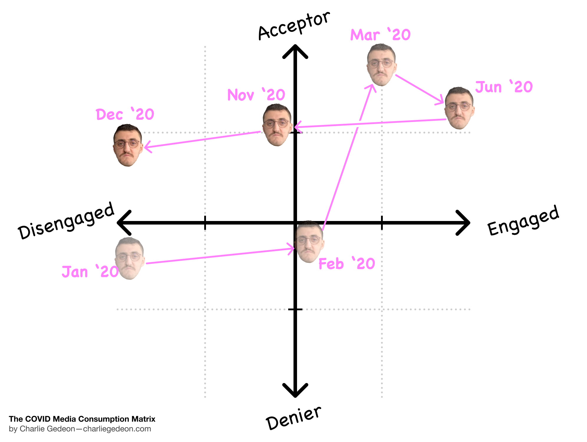
As someone that lived in Canada, the COVID-19 threat was quite distant even in January 2020. Like many in North America, we sat here comfortably watching this thing and thinking it’s just another SARS or Swine Flu scare that will fade quickly. I never really engaged with the news because of its toxicity, so this wasn’t going to get me to care either. By February when things started to arrive on the West Coast, my ears perked but I was still thinking this could be another scare that will fade. Then March 13th hit and Montreal, my city, went in full lockdown. By then I was practically fully sold on the idea after seeing the devastation in China, even going as far as becoming a champion for the government's decisions among friends and family.
This proactive high continued well into June 2020. However, things started to take a turn when the Beirut Blast happened in August and the weight of negative news started to really weigh me down. The U.S. elections didn’t help at all and my grind towards disengagement continued steadily until they ended in November.
Life with COVID being the norm by December, I decided to unplug fully from the news again and resume my previous stance on it: if it’s urgent it will come my way, otherwise, I’ll read an in-depth analysis after the details have settled.
What’s interesting to note is how my acceptance score trended downward slightly. This is because my own government has proven that it was unable to listen to scientists effectively, and so the sheer volume of conflicting ideas (vaccines, required mask layers, distancing rules, etc.) and the lack of trust towards local legislation necessitated an added layer of prudence.
Further applications if time permitted
I would have loved to download a variety of different surveys and apply them against something like this to see where general populations tend to lie. Alas, I simply do not have the time for such a deep analysis at present.
For example, how do education or political impact one’s position on this chart? How did surveys change over the course of COVID in terms of where a given population would lie against this chart?
If anyone is feeling charitable, collaborative, and willing to do this work, please feel free to use the charts above. All I ask is that you share the original article and give credit where it’s due.
Limitations
Even in this simple exercise, it’s clear there are some limitations of a 2-axis matrix for something so complex. I’ve outlined some of the limitations I have come across below:
- Acceptor/Denier currently combines both the government and science to simplify the model. This means that my own score had to be lowered more significantly than I’d have liked because most of my disapproval is towards the legislation and not the science.
- Engaged/Disengaged cannot realistically account for social media and private interactions as well as news consumption. Many people never open a single news link but exchange many messages related to COVID all day, especially people who along the denier spectrum.
- Some of the terms for the personas have inherent positive or negative connotations. For example “investigative skeptic” paints a picture of a vigilante with damning evidence in conflict with the popular narrative looking to expose the evil. This is not my intention at all. In an early version of the model, I labelled each of the 16 personas with a unique name. Unfortunately, this made the naming somewhat too arbitrary and unmemorable for my tastes.
Closing remarks
As COVID continues to rage on and reshape many facets of our society, we are in dire need of better media and tools to make sense of the world. This is but a drop in the ocean of the overall sense-making needed to assess what truly happened and how our society can be more prepared in the future.
My intent with the COVID Media Consumption Matrix is to provide a tool for opening up conversations between people and with oneself. Understanding where you sit relative to people around you or people you follow in the media is a critical step to understanding how your own thoughts might be socially shaped. Understanding where you sit over timecan indicate whether or not you are learning and what events nudged you in a particular direction.
I hope you can gain some benefit from this mental model and I invite you to comment and critique freely. I will gladly respond and, if need be, update this article.