Waverly
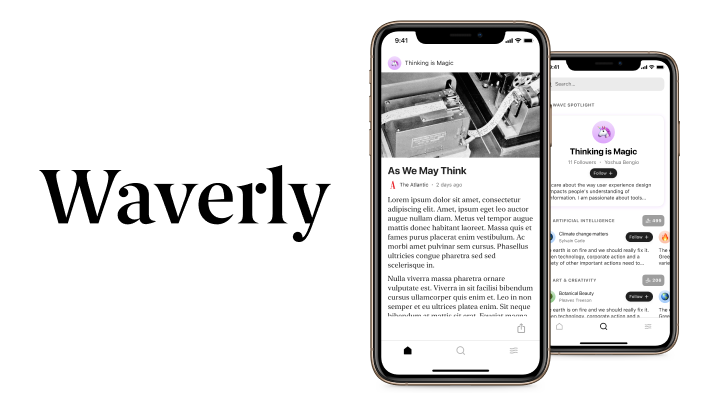
Waverly lets you craft your ideal algorithm — using your own words, no programming required — so you can get the best content feed no matter how niche your interests are.
Overview
Problem: Waverly was gearing up to launch their beta and needed a basic app to test hypotheses about the value proposition
Users & audience: Avid readers, researchers, knowledge workers, and lifelong learners.
Role: Product Designer, User Research, Visual design, Prototyping & Testing
Scope & constraints: A team of 3 developers and 6 months to validate.
Process
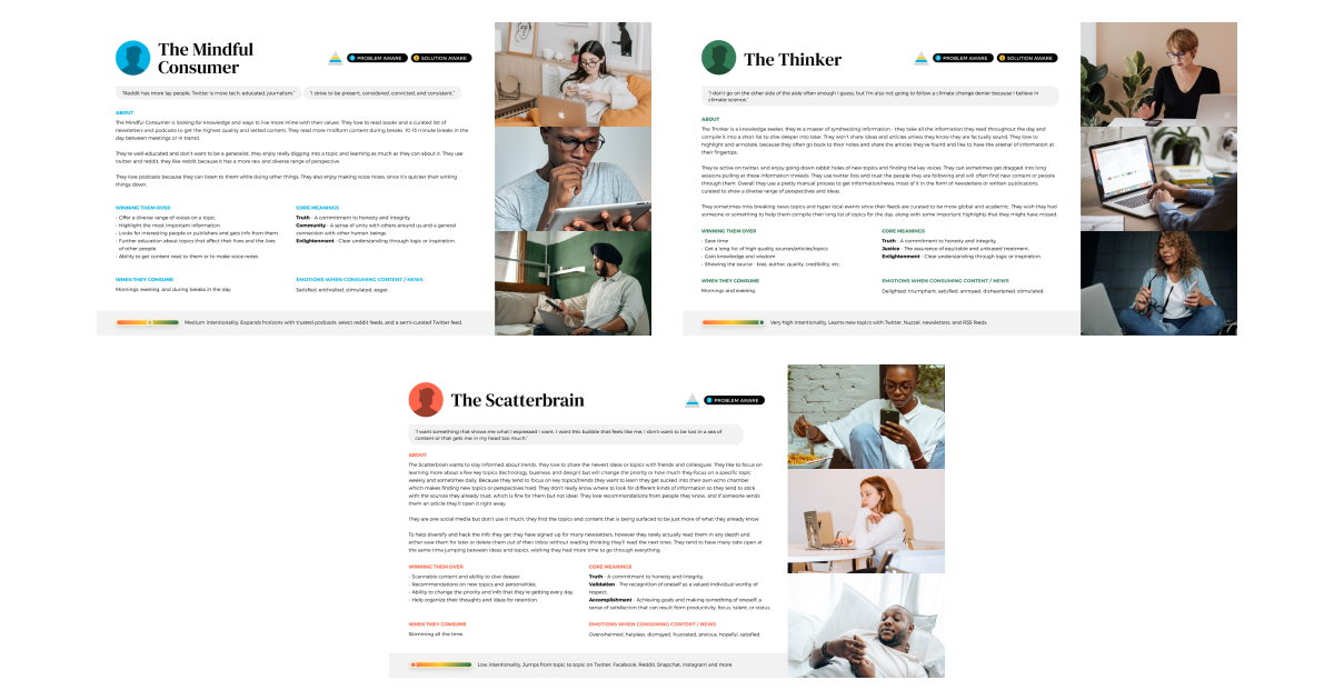
Unlike existing content discovery applications, Waverly used natural language processing to translate a paragraph into an algorithm—called a Wave in the platform. There were no existing interaction paradigms among our competitors so we worked closely with an agency to get a competitive scan, define user personas, and ideate around the initial flows.
We settled on users who are already heavily investing in their knowledge gathering process. Casual social media users and news consumers wouldn't fit the bill for the initial group of beta testers, as the natural language processing system would be in development and likely generate bugs.
App principles
Defining the user personas helped us identify some core principles that we wanted to maintain in the Waverly beta:
- Calmness: Help users focus on a single piece of content at a time.
- Transparency: Clearly show users why the system was recommending articles to them.
- Simplicity: Reduce barriers to discovery and "deep diving" into content that appealed to users in the moment.
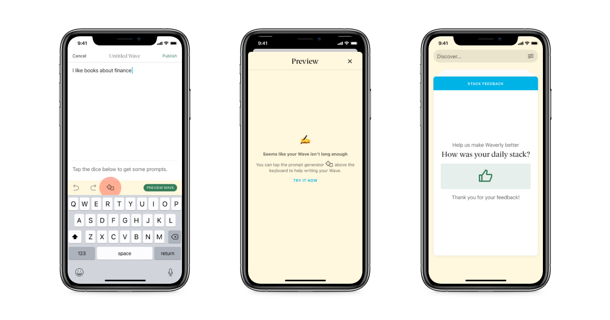
The first iteration of the application had a card based interface with interactions to enable searching, feedback to the algorithm, and flipping between different articles.
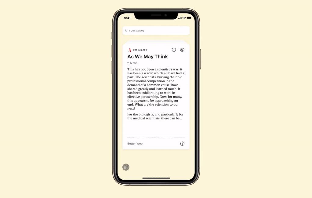
Users would write Waves in a word editor and have the ability to use a mad lib generator to help them with making Waves that worked with Waverly's initial system. The system would then generate feedback cards that the users would use to help inform it about what kinds of content they want to read.
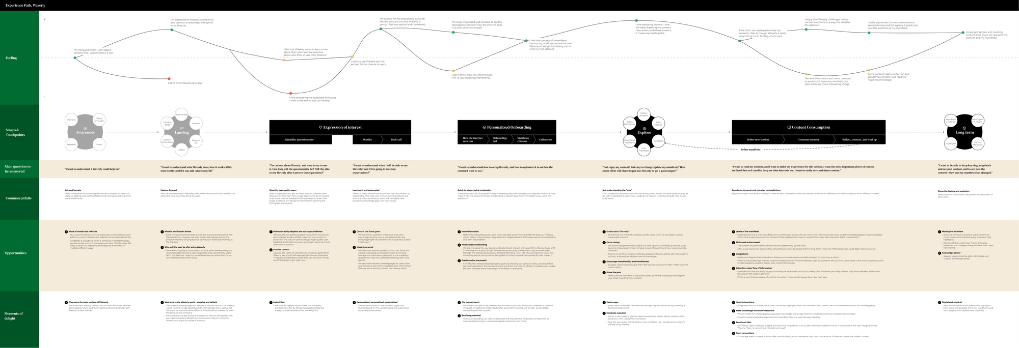
The original beta releases had a highly minimal interface, no images, little navigation, and relied heavily on gestures. This proved unpopular with our users, despite contrasting with some of what we learned in our initial research.
With some of our original hypotheses invalidated, we designed new variations of the product and took them to our users for qualitative research. The following design on the right proved to be most popular.
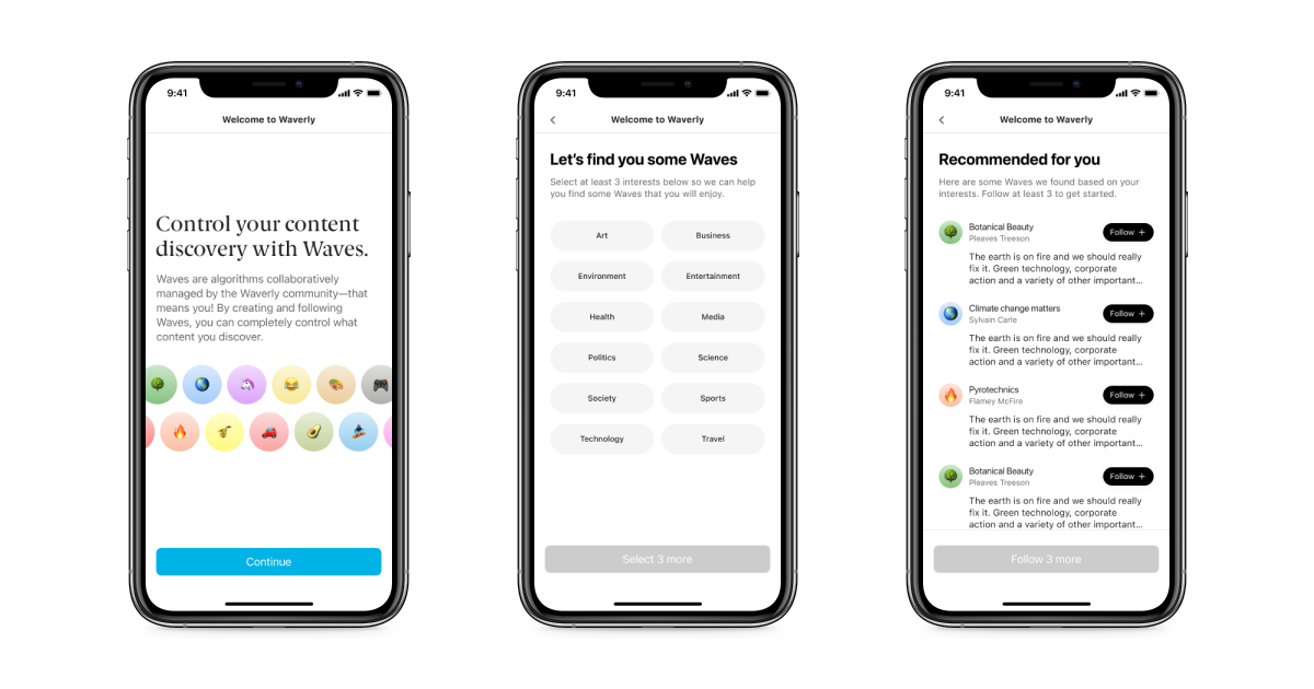
We also learned that the experience of writing Waves was quite difficult without a seed to inspire people on how the platform can work. After doing some research and more rounds of qualitative feedback, we introduced the ability for users to share their Waves and discover other public waves. This also came with a brand new first-time onboarding a new experience.
Results
- Improved engagement with the content Waverly surfaces
- Increased waves per user profile
- Increased the number of daily and monthly active users
Learnings
Waverly started out as an app with a lot of definitions and constraints for what it hoped to be. From the gestural interface to the opinionated stance on a lack of images in order to focus on content. Over time, it became clear that many of these hypotheses, though based on our initial research, proved to be impractical in practice. For a beta, we needed to first validate that the project is a viable business and solves a concrete problem for users. This is what we got to with the final version.