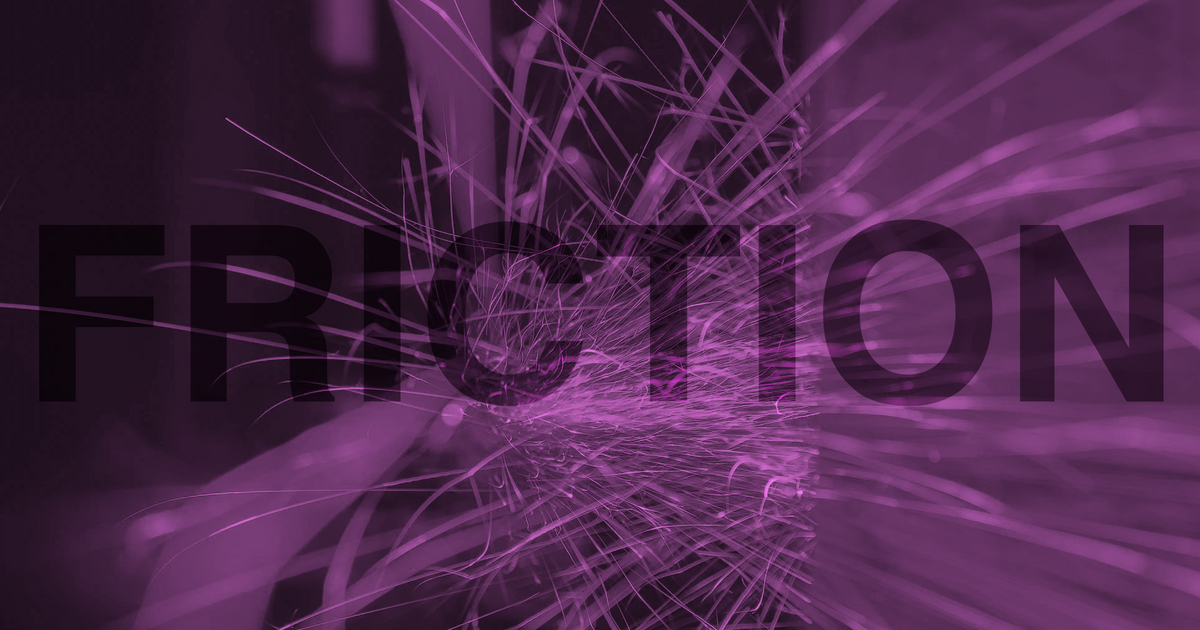
We need more friction in our algorithms
Companies have paid lip service to our digital wellbeing for too long. Now we need to see real change

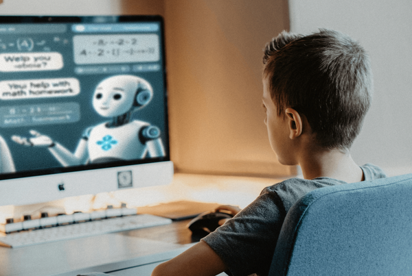
Inan insightful talk by Steve Selzer, the designer and creative director paints a picture of how our “frictionless” world has long been dictated by Silicon Valley startups. In particular, the dominant formula for apps is to make them as brainlessly easy to use as possible. Need a taxi? Hail it with a button. Craving a burger? There’s a button for that too. Want someone to clean your bachelor pad? Button!
Realistically, none of these apps need to be that simple. But unfortunately, startups took the standard of using technology to make our lives easier and ran with it (right off a cliff). And as users, we’ve simply come to accept this as the norm. What’s even more upsetting is that the usability of these apps is totally divorced from how much happiness we get out of them. Despite shining a light on this depressing reality, there was one graph from Selzer’s talk that caught my attention.
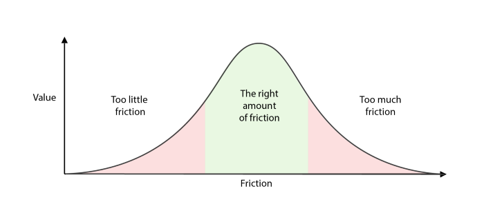
This friction graph, credited to Jesse Weaver, suggests that for an experience to be “valuable,” it actually requires a certain amount of friction. Selzer, who was formerly a design manager at Airbnb, explains how the company actually improved user satisfaction by making certain things on the app more difficult. For example, users were surprisingly happier when forced to reach out to their host rather than contact Airbnb for help. Plus, Airbnb got to cut costs on their customer support. A win-win!
Yet, this example is barely a blip on the radar of disasters caused by frictionless design. It took the rampant spread of anti-vaccination and anti-masking conspiracies on WhatsApp during the pandemic for the messaging app to finally place limits on its easy-forwarding feature. As is too often the case though, it was too little, too late.
Instagram tried to create some friction in 2018 when they tried to reduce users’ screen time as part of a larger digital well-being movement across the tech giants. Their idea of Friction was the ‘You’re all caught up’ checkmark that you see when get to the end of the newest posts in your feed. Though Facebook doesn’t reveal usage data about the feature, not a single Instagram user I know actually stops scrolling when they see it — and I certainly didn’t while I was still on the platform.
Instead, companies need to apply these ideas about friction not just to the interfaces, but also to the algorithms beneath the pixels that users see. In Instagram’s case, rather than spoon-feed you content based on an algorithm intended to maximize your time on the feed, they could tweak the algorithm to need manual input about what specifically you would like to see so that you have to purposely seek out and discover content you cared about. Friction like this might have reduced the monstrous profits that Instagram makes from ads in the short-term, but in the long-run we would have avoided all the mental health problems it has caused and users who put in the effort may even have found it to be a rewarding discovery platform. Better yet, Instagram could give users the agency to decide how they want their feed’s algorithm to behave and provide transparent explanations about the impact of different settings.
Herein lies the secret sauce to many of these companies’ financial success: they have decided that allowing users to set their preferences and see the inner-workings of a platform is bad friction. It’s easy to hide behind excuses like “people don’t want to read” or “algorithms are too complicated to understand” rather than do the hard work of creating interfaces that promote healthy behaviours and genuine user engagement. Those justifications for the current frictionless interactions are merely opinions of the teams within these companies. My favourite take on this comes from the book Weapons of Math Destruction:
Our own values and desires influence our choices, from the data we choose to collect to the questions we ask. Models are opinions embedded in mathematics.
— Cathy O’Neil, author of Weapons of Math Destruction
With each new app, it becomes clearer that the prevalent opinion is to create frictionless, addictive, opaque interfaces. Users are tricked into thinking they’re happy, and companies go home with piles of revenue. Companies are happy to tout adding “friction” as a solution, so long as that friction isn’t enough to impact any meaningful metrics. However, if I call back the value/friction bell curve and add to it a rough mockup of where I imagine addictiveness to lie against friction, I would say the peak of addictiveness happens well before that of value. I call this gap the Business-User Value Gap.
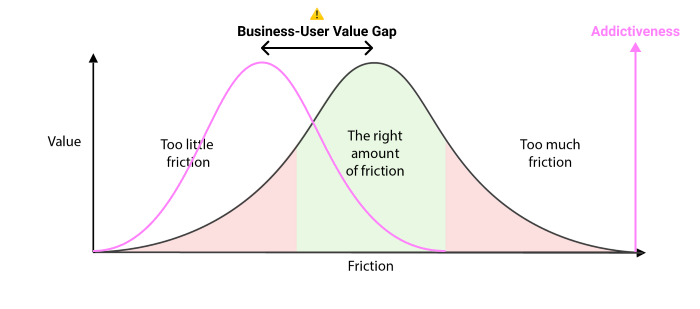
Algorithms, much more than the visual design, are what allow companies to exploit this gap so effectively. We are past the point where all that matters are the pixels and interaction patterns. Instead, we need to start looking under the hood and seriously questioning what we believe a tech’s value truly means for ourselves and our society. Next time you find yourself thinking about making a new experience frictionless, ask yourself if users would actually gain more value out of an experience that requires more than just thoughtless scrolling.
Not all of us will end up with happy win-wins like Airbnb and their customer service example. But we’ve reached a point where businesses that rely on perpetuating completely frictionless experiences should not deserve to exist.