Worth It Labs
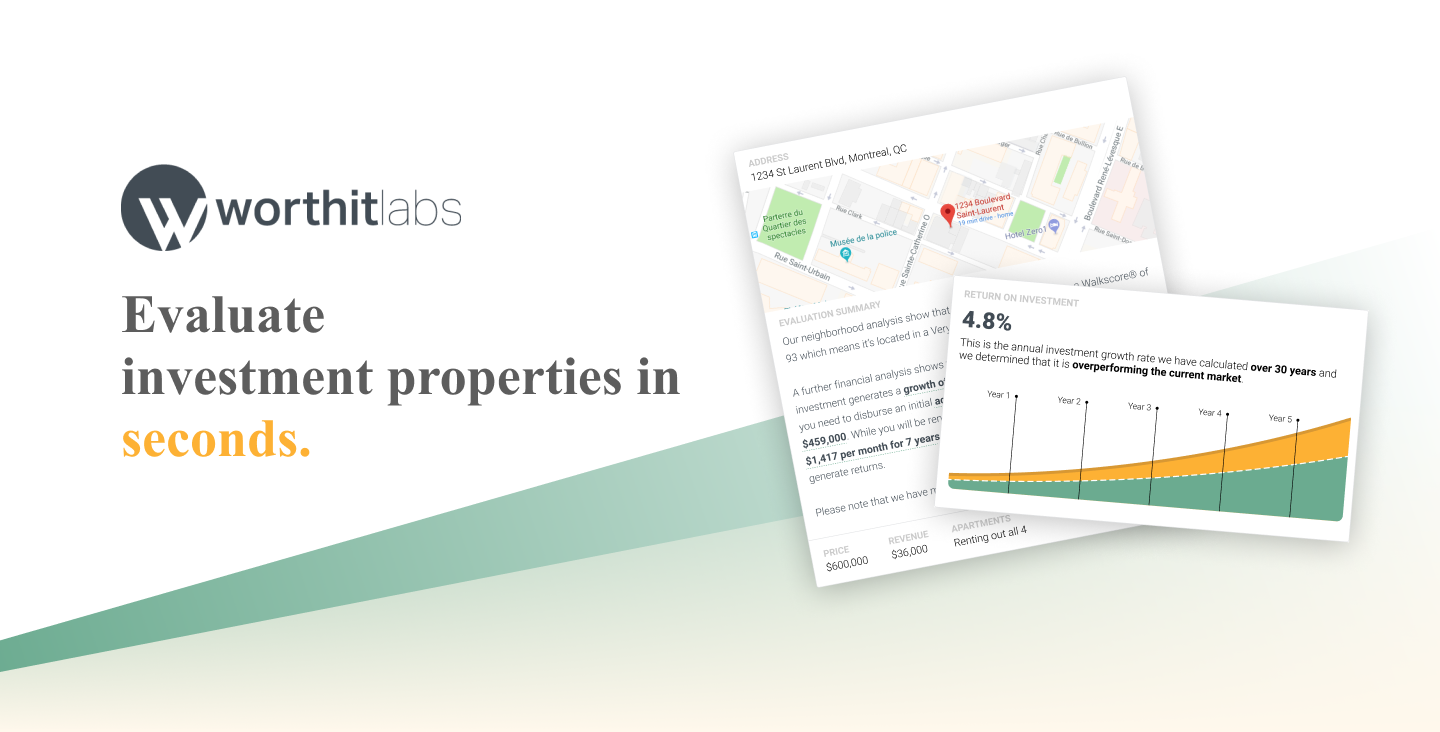
All you need to know if your next income property is profitable. The Worth It Calculator uses localized data in Quebec and correlations with walk score to estimate your expected ROI, cash flow and more!
Overview
Problem: The team had a solution that was difficult for property investors to use effectively and needed to find a solution to increase engagement
Users & audience: Property investors, Real estate agents
Role: Brand Designer, Product Designer, User Research, Visual design, Prototyping & Testing
Scope & constraints: Only one developer and a shoestring startup budget
Process
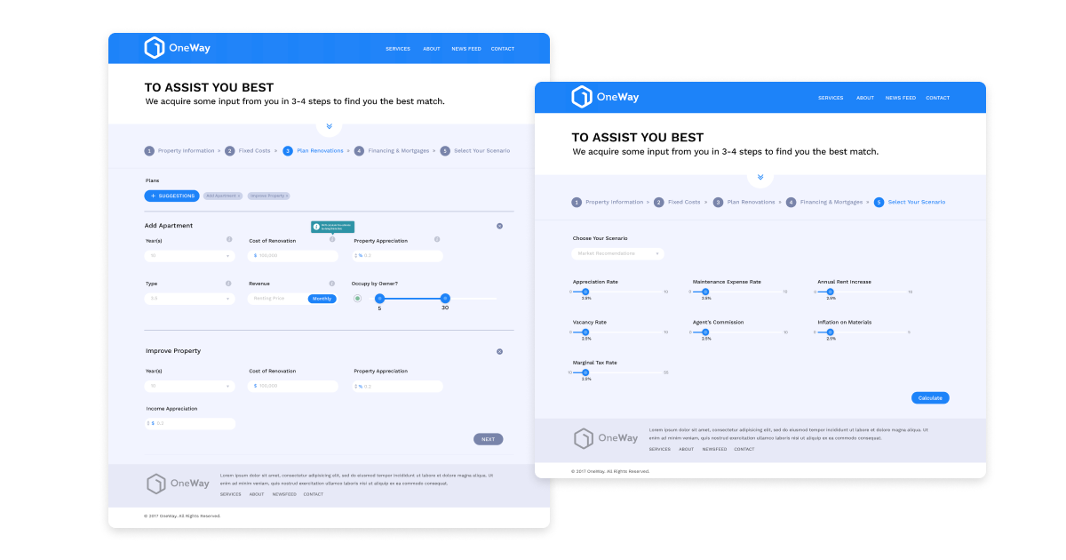
The original product (called OneWay Investments) had a really impressive investment calculator under the hood, but the interface was designed by a team with little design experience. This made it difficult to use and prevented them from marketing the product effectively. I was brought on to:
- Increase app usage of the small but existing user base
- Validate if these users are willing to pay for the app
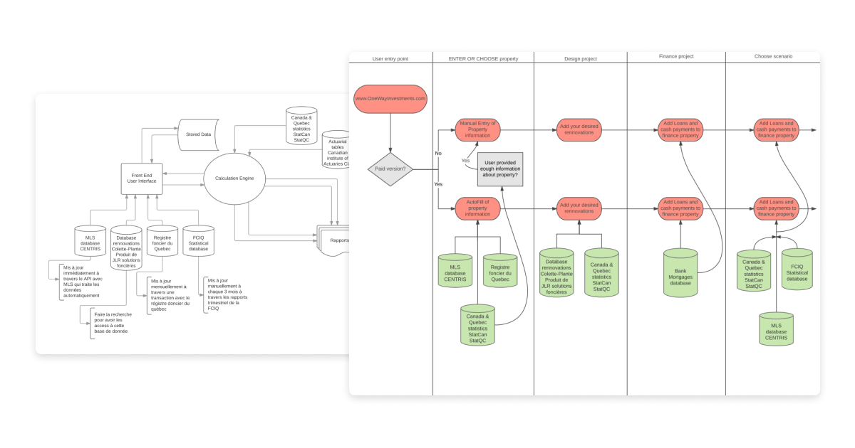
The first place to start was understanding exactly what the product can do, and which of the many outputs it produces are actually for novice property investors.
The second step was determining if we wanted to reach novice investors or experienced ones. Naturally the more experienced would appreciate more data, however we also learned from some preliminary interviews that those investors have their own models.
After conducting more rounds of interviews and discussing the above models with property investment experts, we decided that the best strategy for now would be to build a product to target more novice investors. The biggest challenge that emerged from the interviews is earning our users' trust.
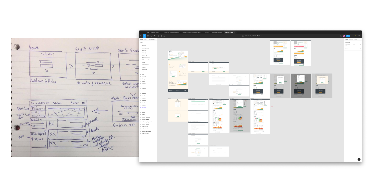
We ran some design workshops and brainstormed several different iterations of the product that had varying levels of complexity, transparency, and explainability.
The design below won as the most usuable product in our user tests. It featured fewer inputs than the original and many of the interim iterations, and had useful summarizing features. However, we couldn't resolve the issue of trust and thus couldn't convert a sufficient number of free users into paying customers.
Results
Though we improved the completion rate of the process with the new design, the decision was made to kill the product as it didn't prove to be a viable business.
Learnings
Despite the success in usability however, without the trustworthiness the product would never convert anyone to a paying customer. No matter what we tried in terms of transparency and explainability, users would still consult a real estate agent or trusted friend.
While there might be design solutions to develop trust, each of them came with an ethical concern. How much confidence do you want to build in someone on an investment based on a computational model?
None of the prototypes we built provided answers that felt sufficient and so the difficult decision was made to kill the product and shut down the business.