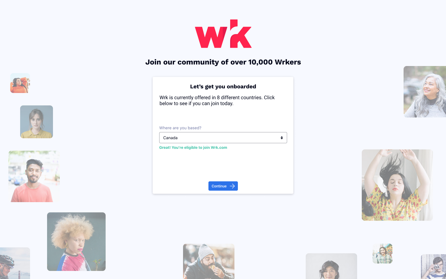
Wrk: A Hybrid Automation Platform
Wrk is a fast-growing scaleup in Montreal building a complex automation platform with a priority toward making it user-friendly and accessible. It's a two-sided platform that consists of clients that are automating tasks, and workers that complete those tasks.
Overview
Problem: I was brought onto the project to conduct the first user research and create the first version of the workflow planner and task completion interface.
Users & audience: IT specialists, project owners, technical directors in small businesses
Role: Product Designer, User Research, Visual design, Prototyping & Testing
Scope & constraints: A highly technical product with a constantly evolving back-end and limited front-end capacity.
Process
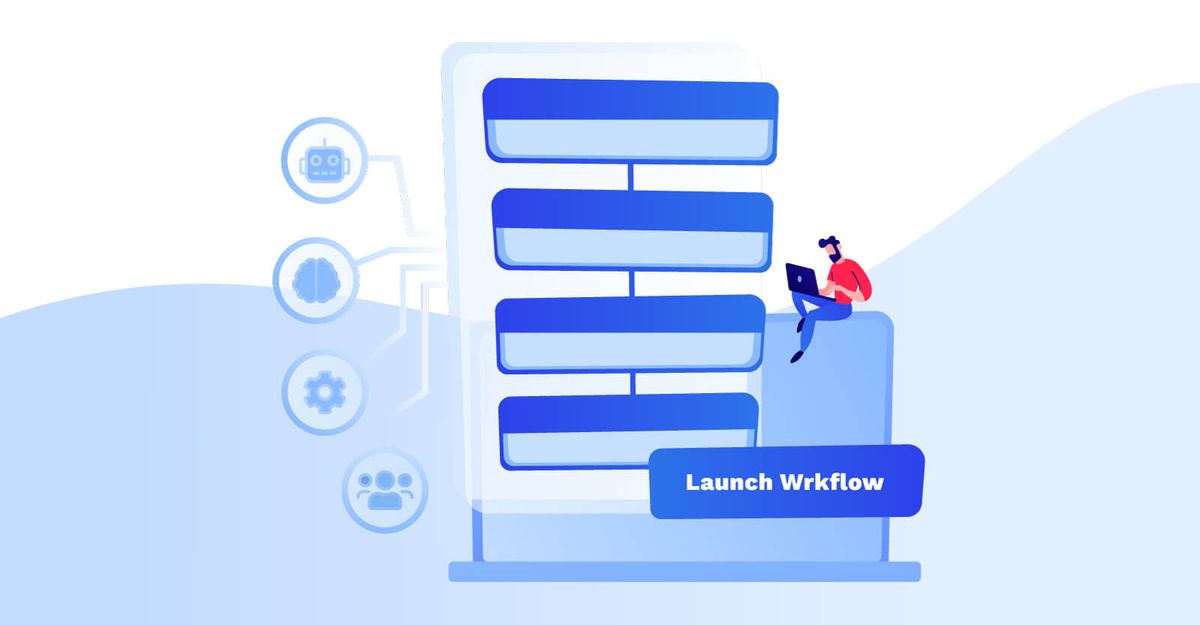
Wrk is one of the first platforms to introduce the idea of a automation workflow designer that leverages crowdsourced human talent. On the project, I had to design both the client side, where they drew workflows and input specifications for tasks to be completed, as well as the worker side where they completed tasks.
Client platform
Despite the system itself being unique, there were already a lot of existing workflow designers on the market. The first step was to conduct research on the competitive landscape and assess the strengths and weakenesses of the different workflow designers.
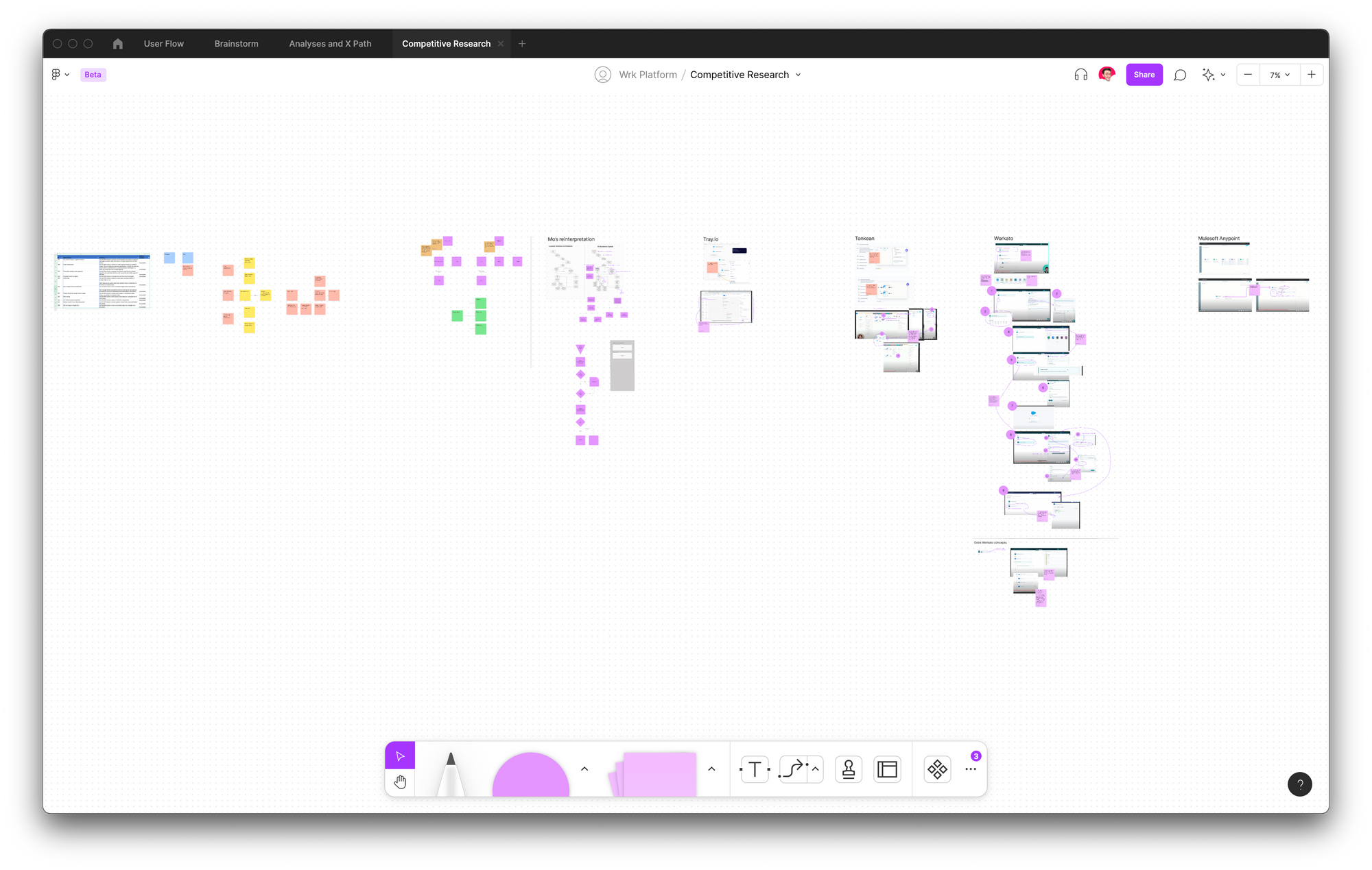
After identifying the traits that we wanted, we started wireframing tests and examples. These were workshopped in virtual co-design session with our operations specialists, development team, and selected clients.
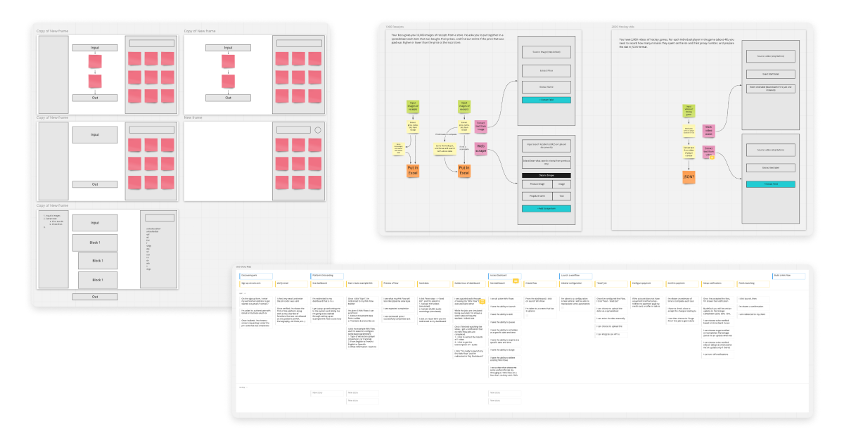
To test some of the higher fidelity wireframes (which I can't reveal here) we used Maze to conduct user tests and see what performed best. While the results were better than we expected, we still saw that there was too much complexity hidden in our designs.
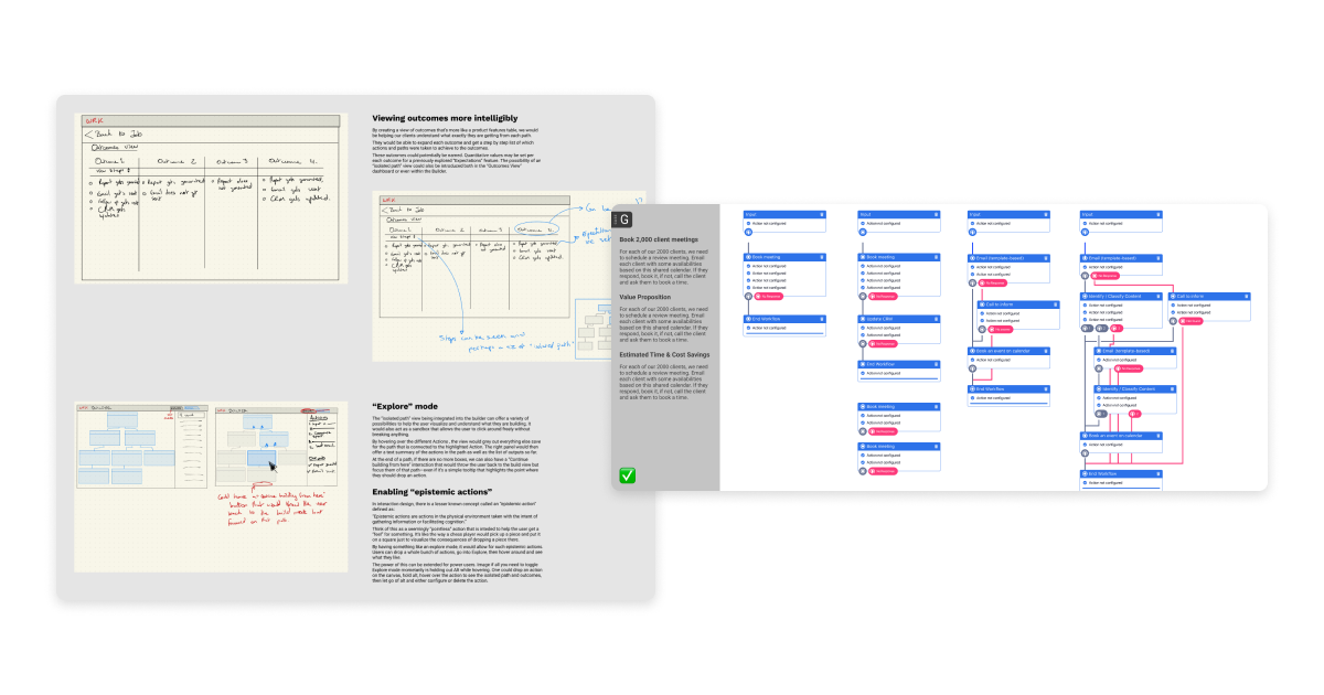
The following designs which performed well in our tests removed a lot of the options in the menus. It focused on simple blocks that allowed users to see what each was doing in plain English.
This client platform is currently what the operations specialists hired by Wrk use to develop workflows for Wrk's clients. The public version intended to be used by the clients directly will be rolled out slowly as.
Worker platform
The worker platform allows anyone complete a task for money from the comfort of their home. Unlike many other gig work platforms, all the tooling is integrated directly in the platform, and the tasks range can be as simple as entring a singly data point into a system, to translating a document.
For this project, the work was focused more on conducting research and establishing some interaction principles that would be implemented in the future.
Looking at other gig work platforms, we wanted Wrk's experience to help workers get started with a task right away and enter a state of flow as they worked on it. We started by getting on phone calls with people who are currently using exisitng gig platforms and learned about their habits. From that we developed some interaction loops and user journeys.
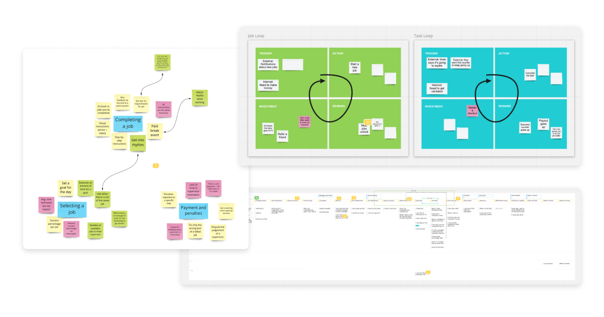
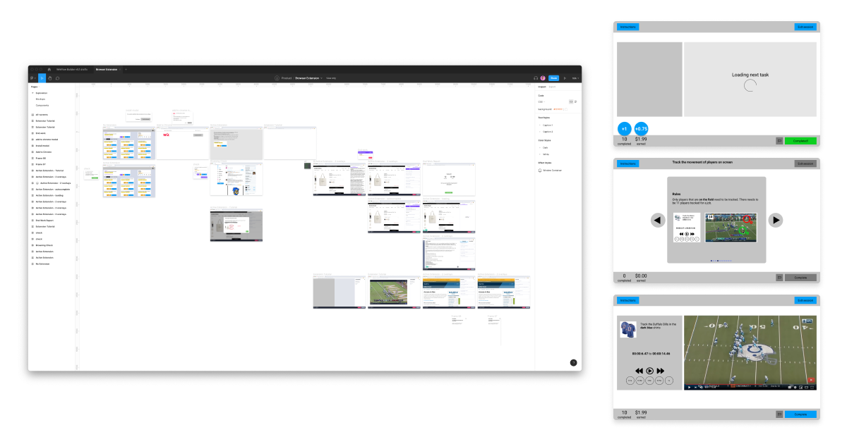
Since the workers are paid to use the platform, we could also afford to reward them quite easily for testing our platform. We build a simple, lightweight platform that would onboard them and give them some simple tasks. Meanwhile, we were wireframing and designing the upgraded version with gamificaiton features.
After some prototyping and more qualititative interviews, we settled on a lightweight design system that involved splitting the screens into one of three configurations. This reduced the amount of time it took workers to understand the various different workspaces that they might encounter on the system.
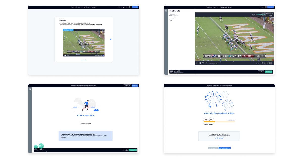
The system was launched as an initial beta and quickly grew from 200 to over 2000 workers in just a few months. The layout and onboarding have allowed for 10,000s of jobs to completed through our platform to serve our clients.
Learnings
The project was primarily about building the initial systems for both the clients and workers. Working on two different platforms and coordinating with an internal operations team to keep existing clients happy helped us prioritize what's most important. A lot of time was spent discussing the taxonomies, and while this was useful, it would have been more impactful to release designs more quickly and iterate on those.